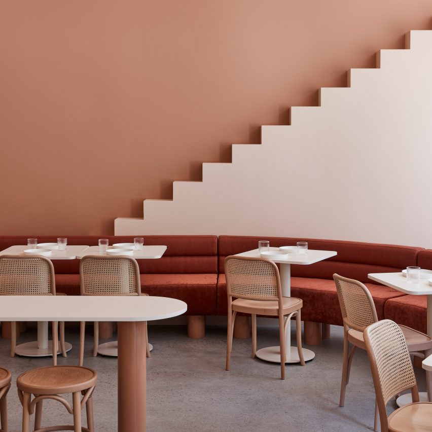
Melbourne-based interior design studio Biasol used earthy hues and stylised architectural motifs to create a destination inspired by Wes Anderson‘s symmetry and nostalgic colour palette.
The Budapest Cafe in Carlton, Melbourne is Biasol‘s second edition of its Wes Anderson-informed concept, following a first location in Chengdu, China, that featured marble surfaces and pale pastel greens.
The 94 square-metre cafe has similar pastel shades, but in earthy colours that have been adapted to its Carlton setting and audience.
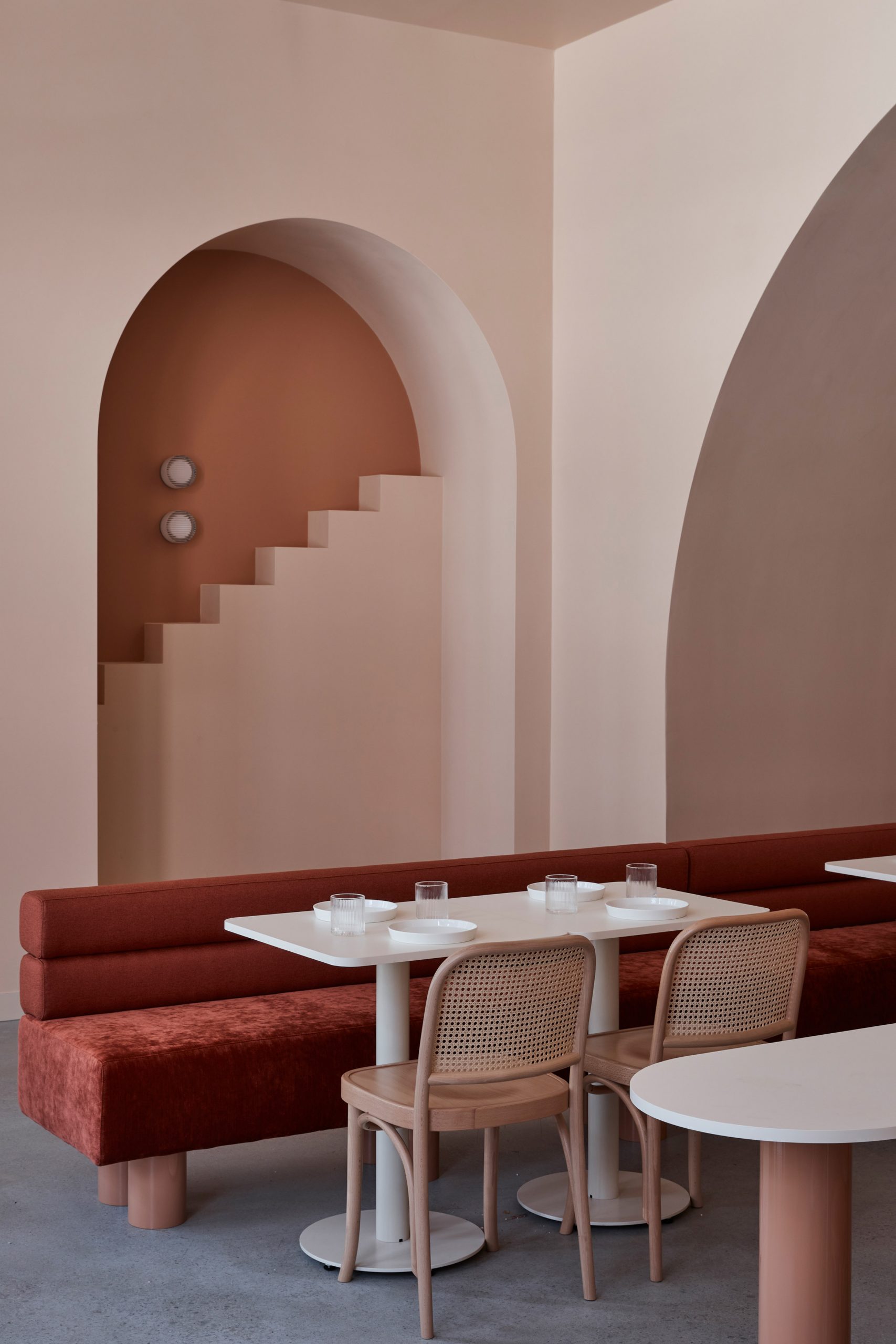
“Our design draws on Anderson’s meticulous, memorable and magical worlds to create an inviting destination with whimsical character and mythical scenes,” Biasol founder Jean-Pierre Biasol told Dezeen.
“We were also inspired by his symmetry and quirky set designs; vivid and nostalgic colour palettes; and the sentiment that infuses his films,” Biasol continued.
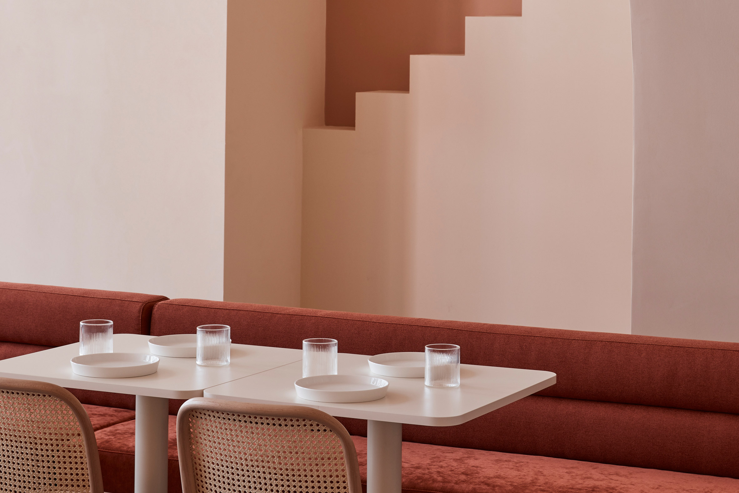
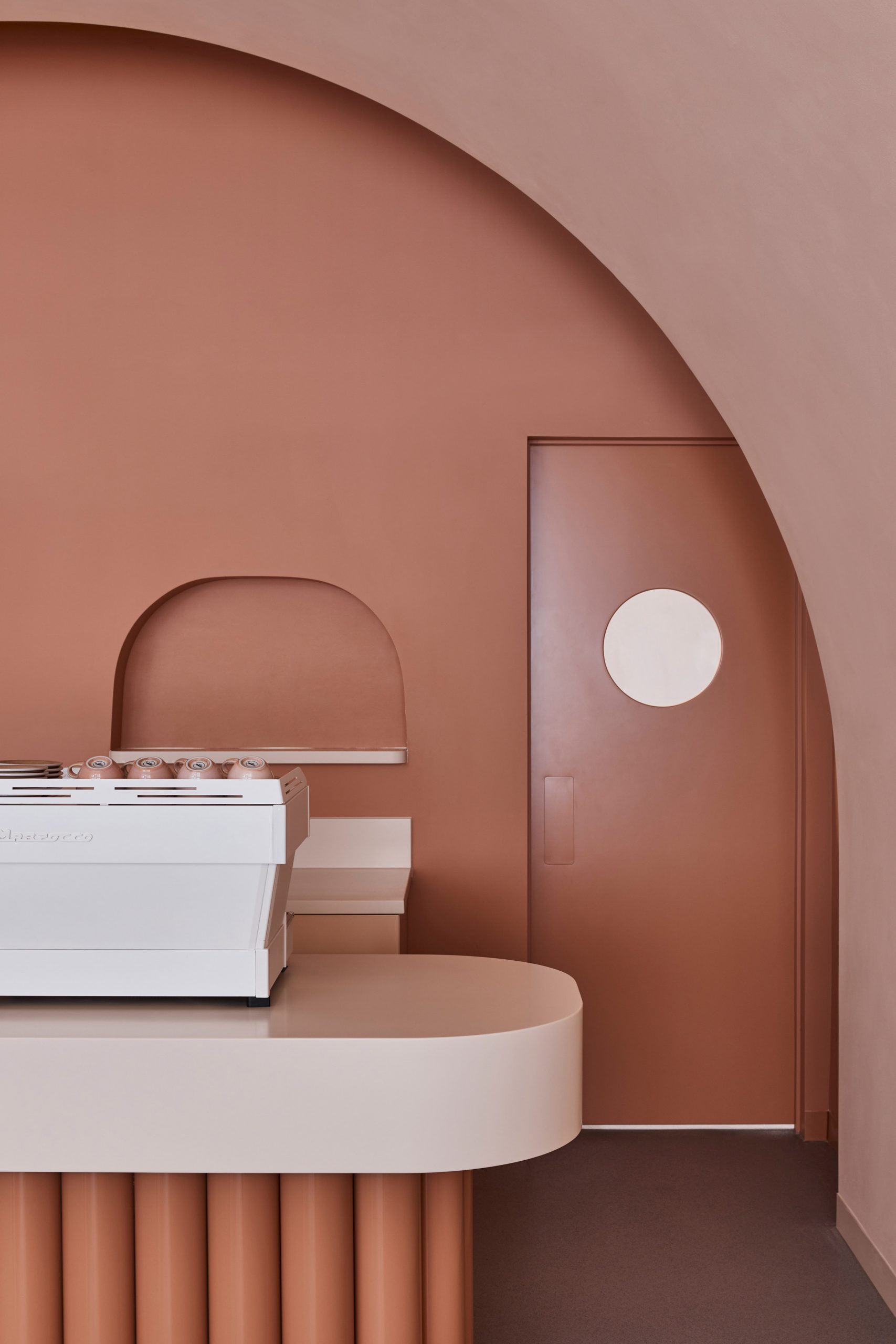
The studio played with depth by applying dark tones like terracotta and orange to the walls, while softer beige and sand hues blanket the fanciful elements in the foreground – including focal archways reminiscent of Wes Anderson’s 2014 feature film, The Grand Budapest Hotel.
“We evolved the design and experience to an earthy colour palette reflecting our local sensibilities,” Biasol explained.
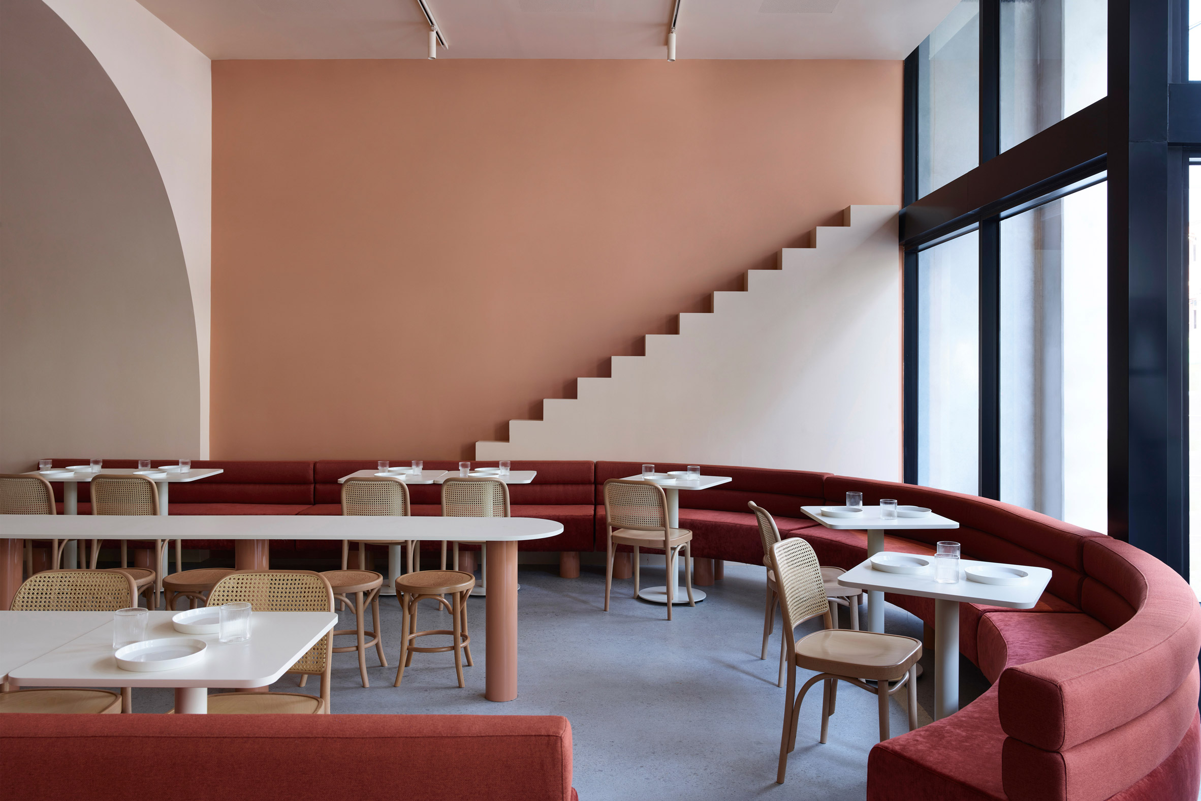
Rust-red upholstered banquettes wrap around the space, adding texture and warmth to the double-height space, and envelop a bar table that functions as the centre of the seating area.
A large sand-textured archway frames a glossy, tubular point-of-sale counter in terracotta, both of which draw customers through the space. Subtle silver hardware, meanwhile, provides a bright, metallic contrast to the softer tones.
The studio’s fondness for modern abstract art, design, and hospitality informed its decision to create “an immersive gallery-like experience,” Biasol said.
This led to an exploration of form and colour, with the aim of designing a place where art meets architecture.
By reducing the interior’s built form, the studio created a dramatic visual aesthetic. Stylised steps to nowhere embellish the venue’s walls, rising behind the tubular counter framed within arched alcoves and encouraging patrons to engage with and capture the “imaginative and evocative” design.
“With a richer palette and bolder design, the new cafe is timeless and contemporary for its Melbourne patrons, while still offering a relaxed and indulgent atmosphere and hospitality experience,” Biasol said.
The Budapest Cafe is one of many projects the studio have completed globally. In 2019 Biasol completed contemporary dining spaces for Grind in southeast London, as well the interiors for this east London townhouse.
Photography is by Derek Swalwell.
The post Biasol plays off Wes Anderson’s whimsical style with The Budapest Cafe in Melbourne appeared first on Dezeen.