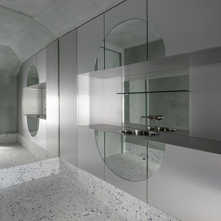
A palette of plaster, marble, terrazzo and stainless steel was chosen to create interiors that customers want to “reach out and touch” in this Dublin skin clinic by Kingston Lafferty Design.
The local firm was commissioned by the Fitzgerald Private Clinic to capture a sense of calm, quiet luxury while maintaining the cleanliness expected from a surgery.
“The service offer is premium and luxury, and the spaces that encapsulate it were designed to echo that at every touchpoint,” Kingston Lafferty Design founder Roisin Lafferty told Dezeen.
“We wanted to design a space that was tactile and all-encompassing with a sense of otherworldliness, incorporating associations of sterility with a balance of warmth.”
Spread across two tight, 46-square-metre floors, the Dublin clinic houses retail, storage and waiting areas on the lower level while the first floor encapsulates three treatment rooms, a toilet, staff room and secondary waiting area.
“It is a very small space, so we needed to be clever when designing the layout to get the absolute maximum use from the space,” explained Lafferty. “Every element is jigsawed together to double up, offering both functionality and beauty.”
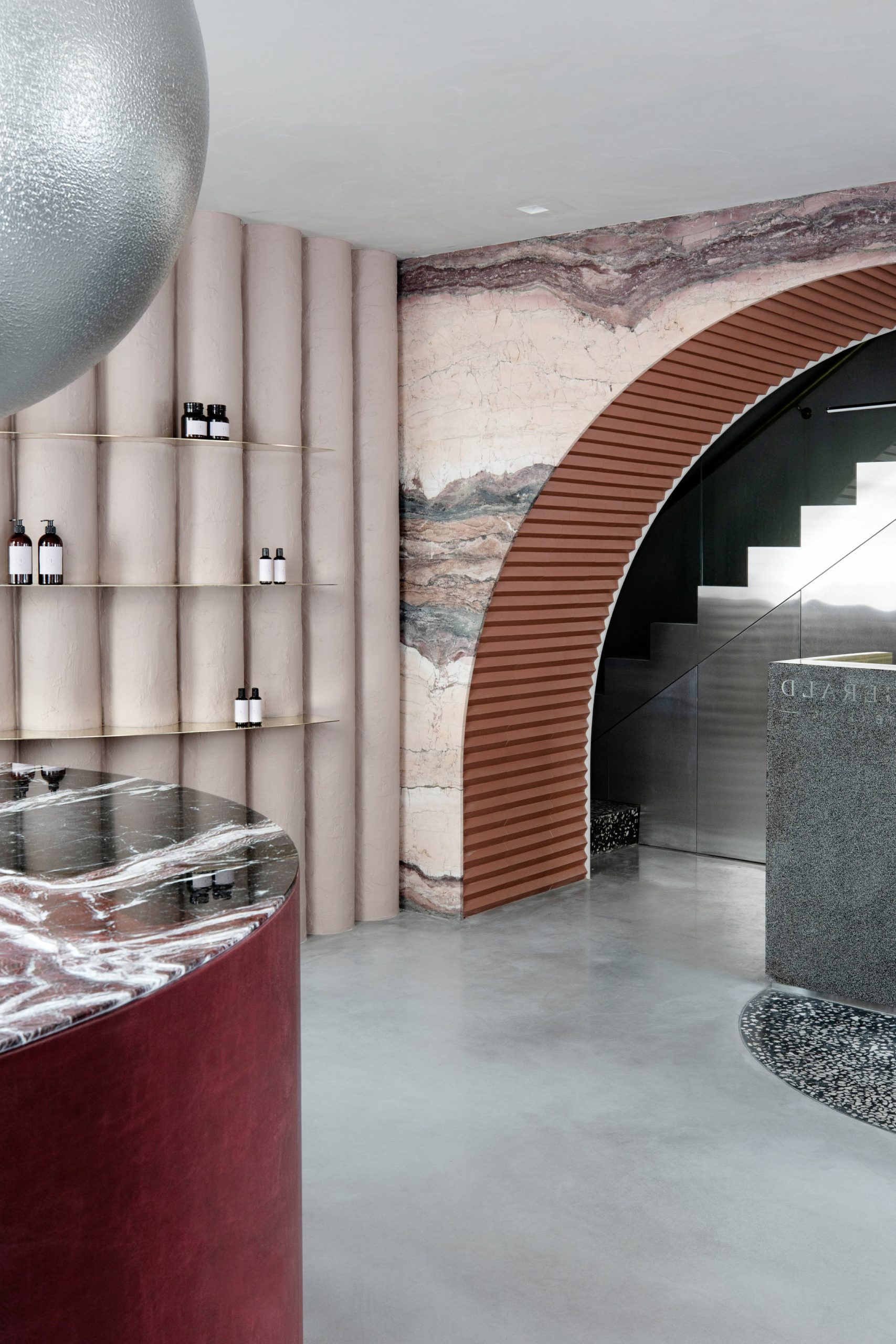
Customers enter the clinic through a street-facing, pink-hued retail store with a micro cement floor and a curved wall lined with plaster tubes. According to Kingston Lafferty Design (KLD), these were designed to resemble putty and made from multiple layers of warm-toned plaster that were built up within a custom mould.
“We wanted the different surfaces to be tactile and combined in unexpected ways, almost calling for people to reach out and touch, and for everything to appear as though it was formed from the structure of the building, as though it was all meant to be there,” said Lafferty.
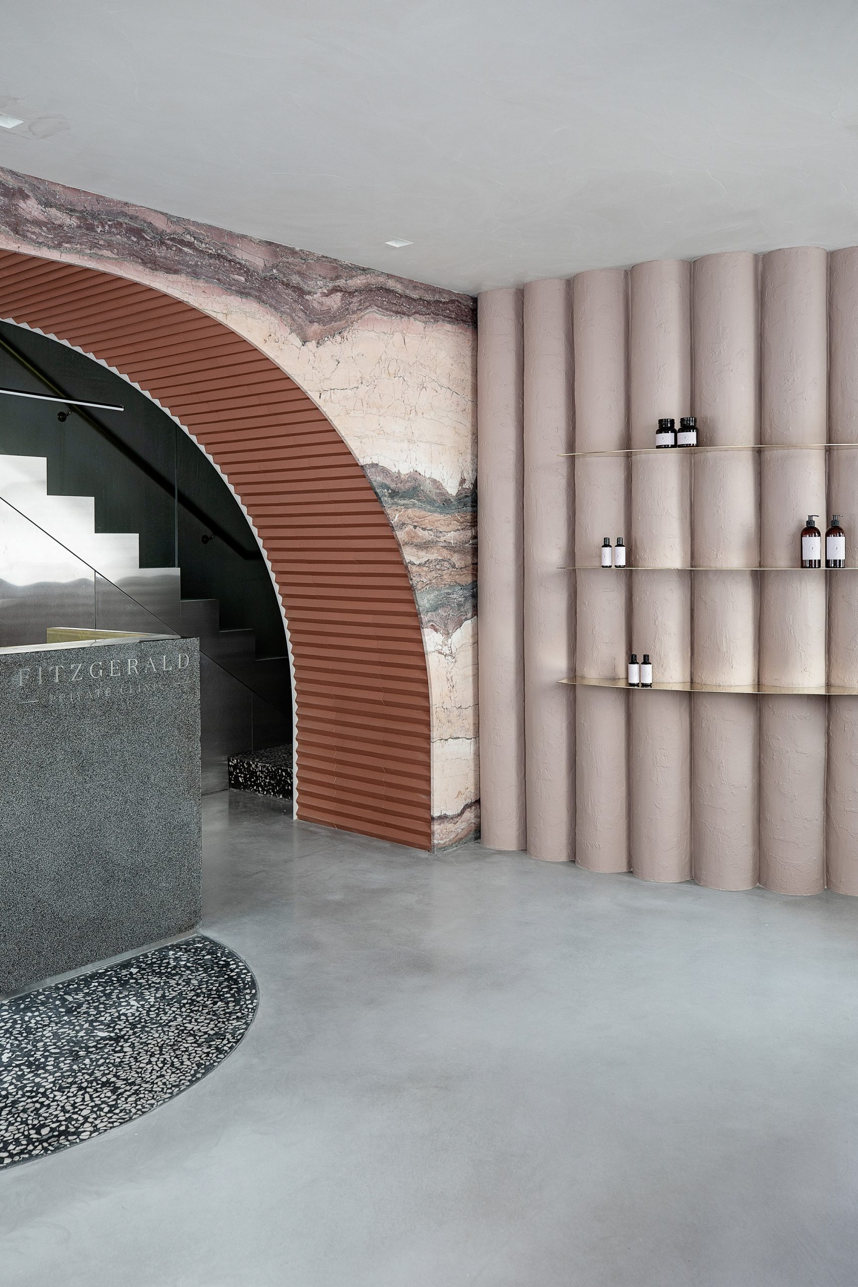
Set with three brass shelves, the undulating wall doubles as a retail display area and also conceals added storage space behind a fully tube-clad door.
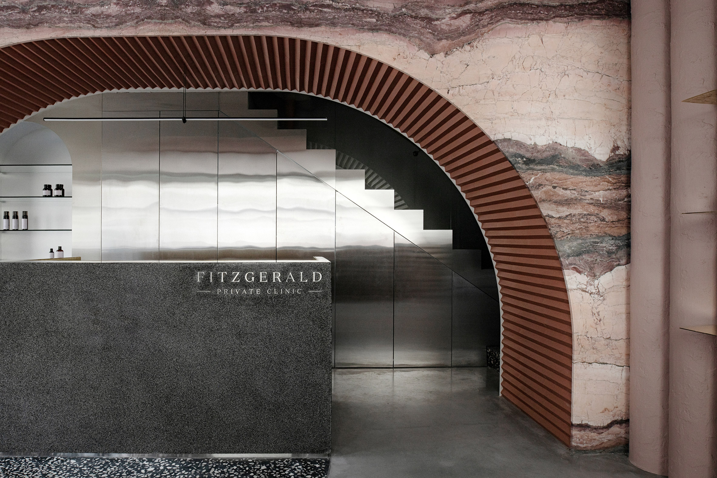
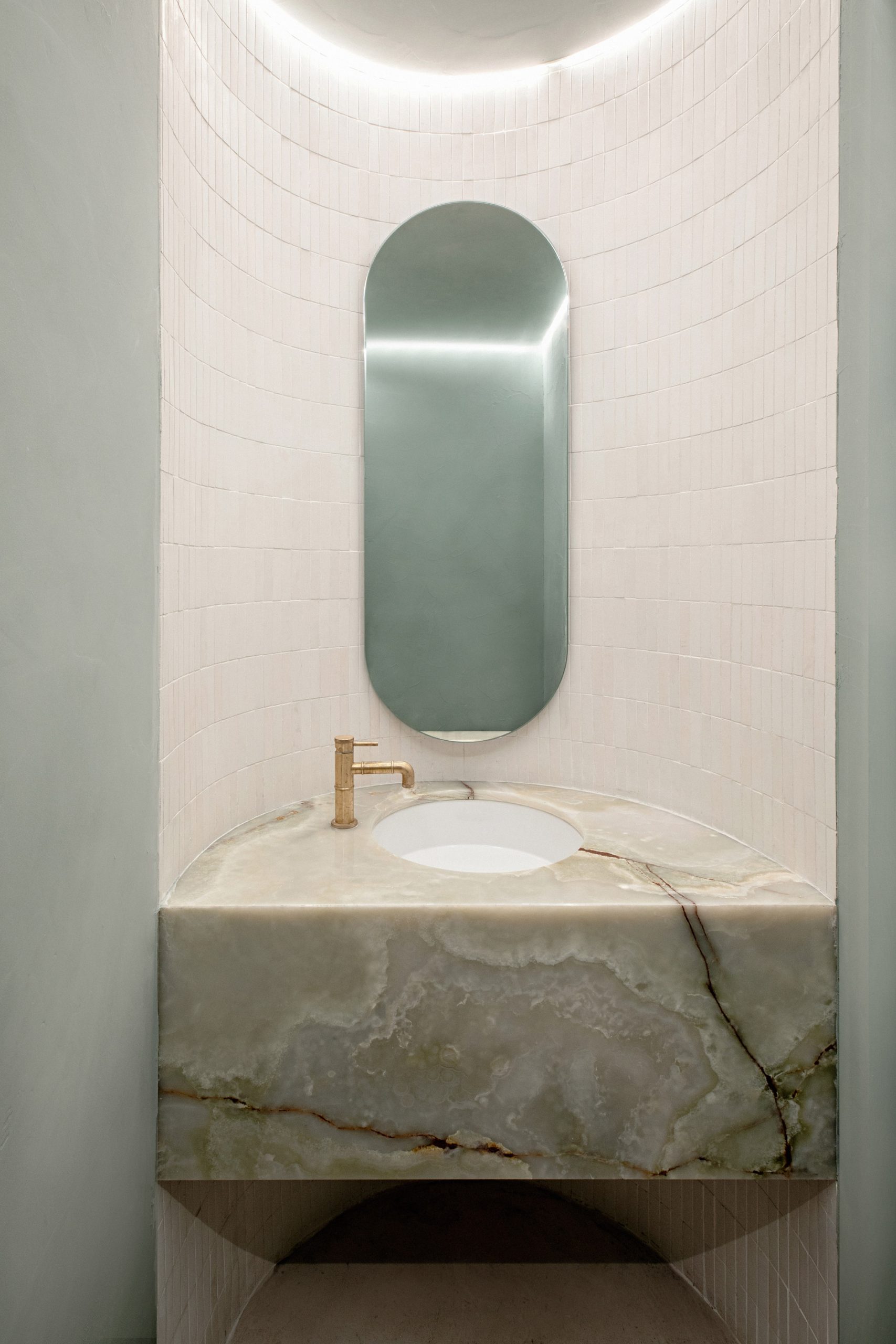
The entrance area is anchored by a black and white terrazzo reception desk that sits under an Acquasanta marble archway. The underside of the arch is clad with zig-zagging matt red tiles that complement the tone of the marble.
“The arch is the strongest element that frames the clinic experience,” the designer explained. “It highlights the sales and reception desk while encasing and concealing an existing structural beam. We built the arch to align with the depth of the custom reception desk, focusing on materiality both on the front facade and the inner depth.”
The skin clinic, which sits beyond the arch, contrasts with the soft pink tones of the store. It features a stainless steel staircase and black and white terrazzo flooring, with the archway marking the junction between the two.
“The staircase was the only structural element that we kept in the design. We sought to make a feature of its angular form and framed it in steel and glass, the steel providing both a tactile wall covering and a vital storage bank with additional retail display for product,” Lafferty said.
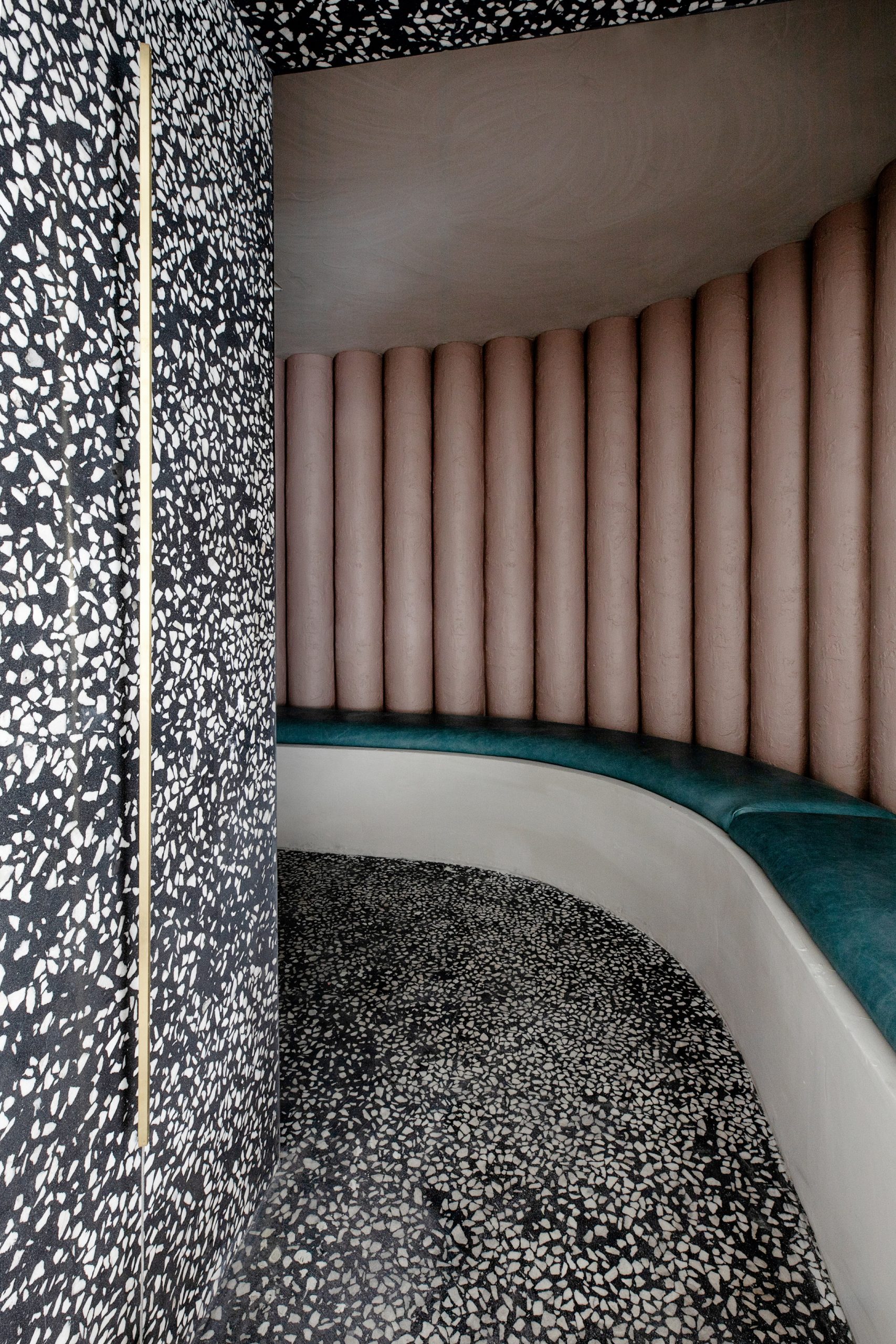
An intimate waiting room wrapped in terrazzo and housing a bench seat upholstered in blue leather is located on the other side of the store’s curved, undulating wall.
On the first floor, mirror- and walnut-clad boxes create a series of interconnecting treatment rooms and corridors.
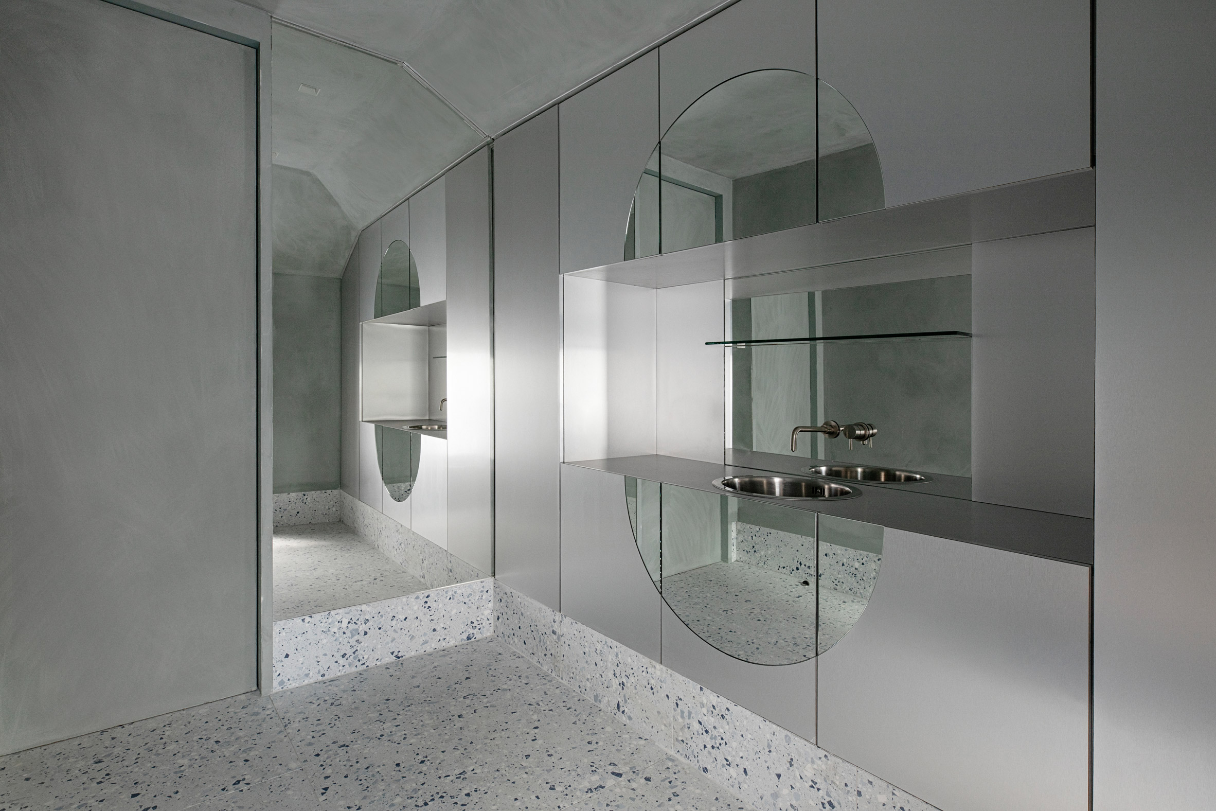
“The treatment rooms needed to be highly clinical, sterile and very easy to keep clean,” said Lafferty. “Hygiene was of the utmost importance to the client. So we wanted to find a balance so that it didn’t feel cold and unwelcoming.”
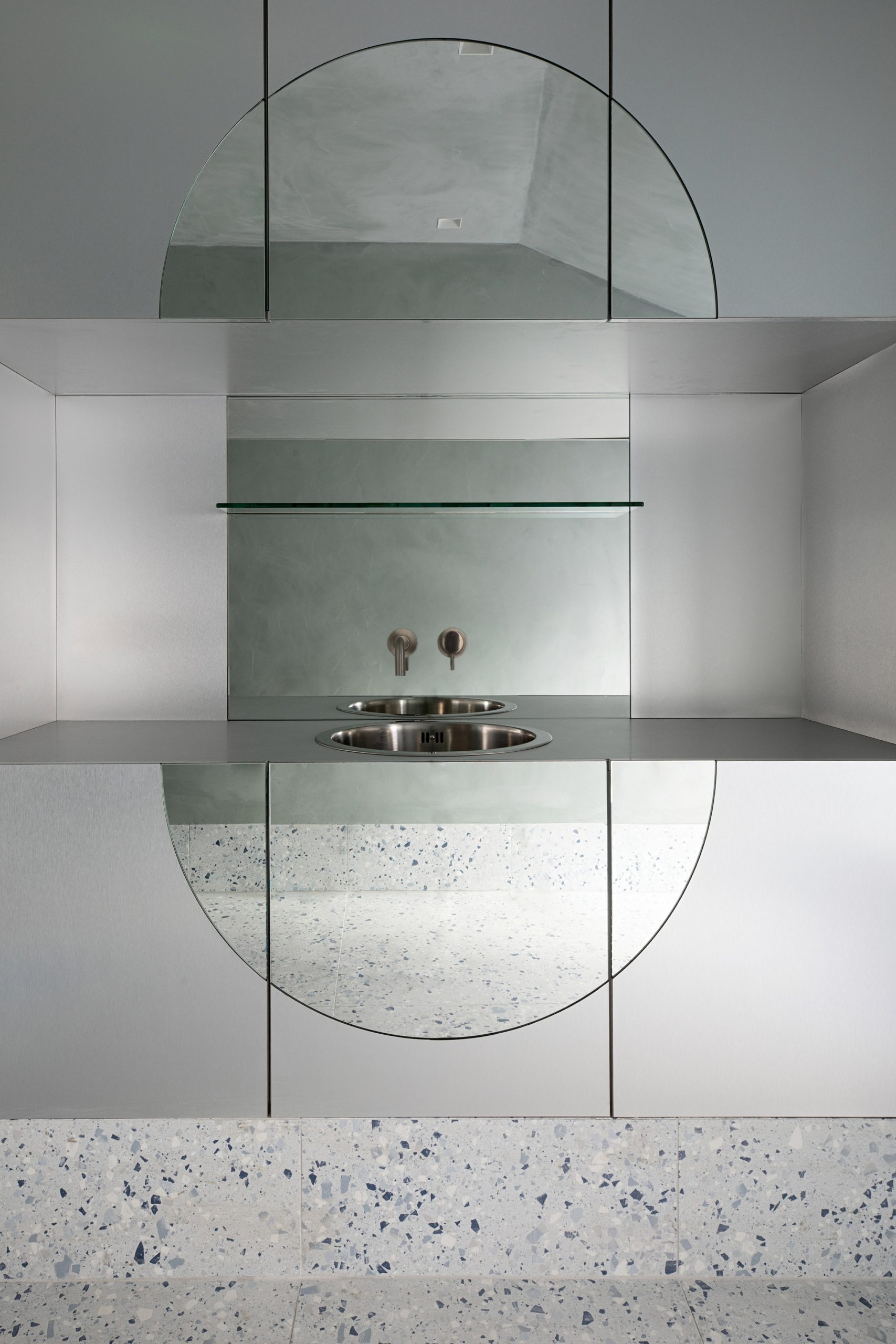
Lozenge-shaped mirrors were added to disrupt the rooms’ clean lines and add softness, while subtle colour changes were introduced through a blue tone in the terrazzo and a hint of green in the textured plaster walls and ceilings.
A seamless, full-height wall of walnut wood was added to the corridor outside the treatment rooms to contrast against the steel cabinetry and add warmth to the upper floor.
Health and self-care was a central theme in another of KLD’s recent refurbishment projects. Earlier this year, the studio incorporated green walls, a yoga studio and rooftop terrace into a co-working office in Belfast to help workers unwind.
Photography is by Ruth Maria Murphy.
The post Kingston Lafferty Design creates “otherworldly” interiors for Dublin skin clinic appeared first on Dezeen.