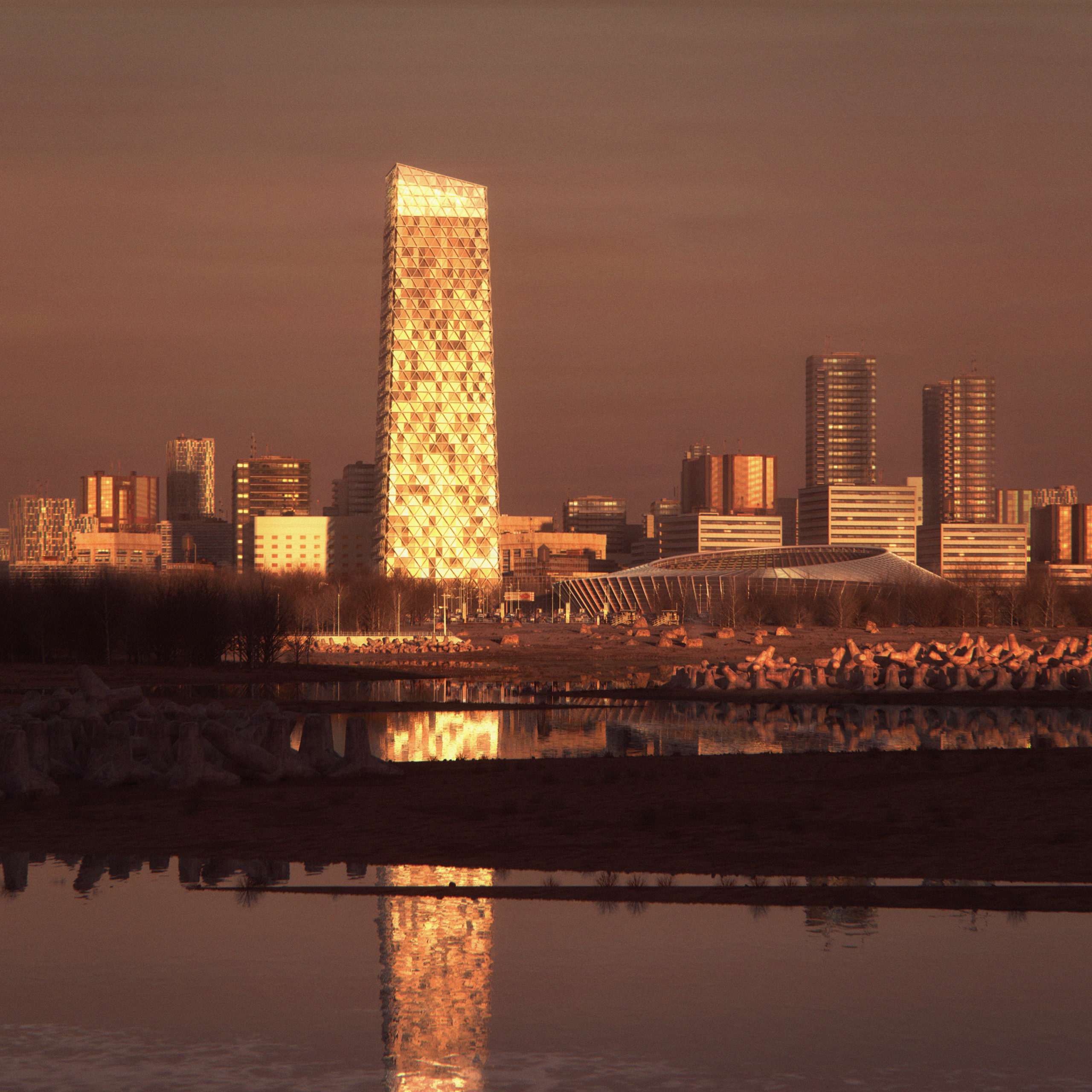
Francisco Tirado, a visual artist at Danish architecture firm Cobe, was the Non-Student Grand Prize Winner in Architizer’s 2nd Annual One Rendering Challenge with his submission, entitled “Sun Hit”. The image depicts what you might think is a straight-forward, everyday subject for an architectural rendering — a glass skyscraper within a city skyline.
However, Tirado’s image is anything but ordinary. The time of day chosen for the visualization turns this urban landscape into a breathtaking scene, capturing a “magic hour” in which architecture plays supporting role to sunlight in producing an unforgettable atmosphere. “I always got amazed by the summer long evenings in the north, where the sun barely goes off on the longest days of the year, and right there, when the sun is touching the horizon line, if you look around you can see incredible reflections and reddish tones everywhere,” explained Tirado.

Tirado’s winning rendering “Sun Hit”; image courtesy Francisco Tirado
The rendering, highly realistic yet possessing otherworldly qualities, captured the jurors’ imagination and helped Tirado to win one of two Grand Prizes of $2,500. Architizer spoke with Tirado about his winning rendering, the creative process behind it, and what other One Rendering Challengers can learn for their next submission.
Congratulations on your success! What does winning the 2021 One Rendering Challenge mean to you?
Thank you very much! It means a lot to me, I completely didn’t expect it. Within the competition finalists, there are a lot of artists that I have been admiring for a very long time, and for me just being among them as a finalist was a great honor; even with that I was really happy.
What were the primary challenges of conceiving your work, from forming the idea to the actual physical process of rendering?
When I do personal projects, to me the most difficult is always the question “what to do?” — the possibilities with 3D are almost endless, so there is a fear of the white canvas. The way I solve this problem is looking for references.
I have a very large photography library, so the first step is to jump into it and gather at least 5 to 10 references. Then, I observe how the light behaves and where the colors and composition work the best. When I have a clear idea of what I want to achieve, the technical aspect is actually not that complicated — it is mostly about “what to do?” rather than “how to do it?”; If you know it, you will find the way.
Did you use your usual techniques and software for creating this rendering? If you tried something different, how did that go?
No, I didn’t use the workflow I use on my daily work, because it won’t work for our office. I actually did the opposite as a way of experimenting; I conceived the image as a personal concept, so instead of designing a building, and then portraying it in the best way possible, the process was the reverse — I locked a composition and lighting with simple volumes; I knew I wanted a reddish image, with a strong focal point reflecting the sun.
Then I created a scenario, and a building, that will work on it and for it. Creating concepts this way is a very useful process to practice because you can simplify the 3D modeling; it is a way of composing a 3D image in a 2D way, only working on what is visible.

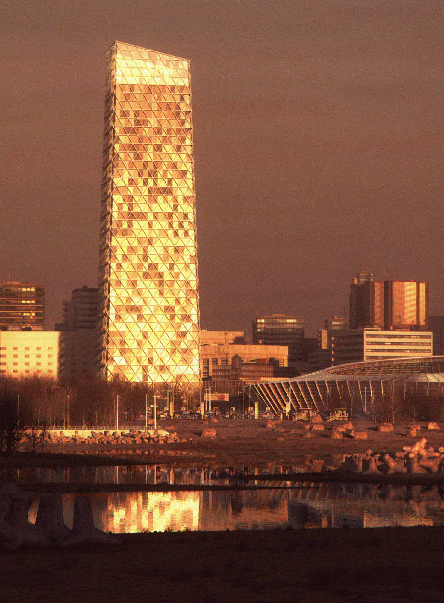
Detail illustrating the incredible colors generated within Tirado’s visualization; image courtesy Francisco Tirado
What connection does this image have to you and your personal feelings about architecture?
I am originally from Seville, the south of Spain, and as I mentioned in the description, since I have been living in the north of Europe, the light is the thing that impressed me the most. Here, I can see tones and moods I have never seen before. Oftentimes, I try to capture those moments within pictures of architecture; I believe it is just so beautiful.
Do you have any other work that compares to this in terms of lighting, atmosphere and composition?
Yes I do, I usually do lots of small tests to keep practicing, mostly there is where I experiment with new atmospheres. So this image is the second where I used it, it follows a simple test I did before. Those test images are usually very simple ones, the idea is keep experimenting and learning without actually spending too much time on details. Once you understand how the light works, to jump to a more complex image is way easier.
What one tip would you give students and architects looking to win next year’s One Rendering Challenge?
I would say do not focus on creating a winning image, instead keep learning and exploring thought practice and testing, keep doing it, and eventually after a year, pick the best work from this period and submit it. This way you completely detach yourself from the result; you know you have done your best and you have learnt a lot during the process. Then let’s say you either win the contest, or become a much better professional, or both — either way, you always win!
Thank you to all One Rendering Challenge participants for their hard work in creating amazing visualizations and telling fascinating stories about architecture. If you are interested in entering next year’s One Rendering Challenge for a shot at $2,500, be sure to sign up for updates by clicking the blue button below.
In the meantime, keep on rendering!
The post Cobe Architects’ Artist Wins One Rendering Challenge With “Magic Hour” Visual appeared first on Journal.