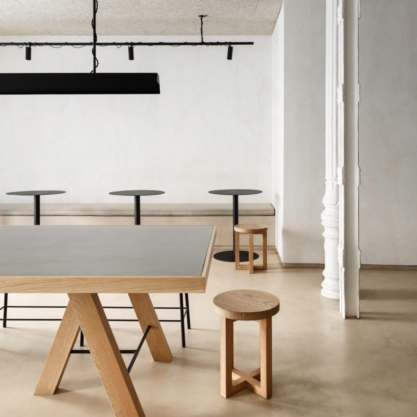
Spanish firm Plantea Estudio has layered “light and warm” materials such as plywood and chipboard to create the interior of this Madrid street food restaurant.
Called Zuppa, the eaterie is located on one of the city centre’s main streets, the Calle de Atocha, and occupies a commercial space that was previously home to an Indian takeaway.
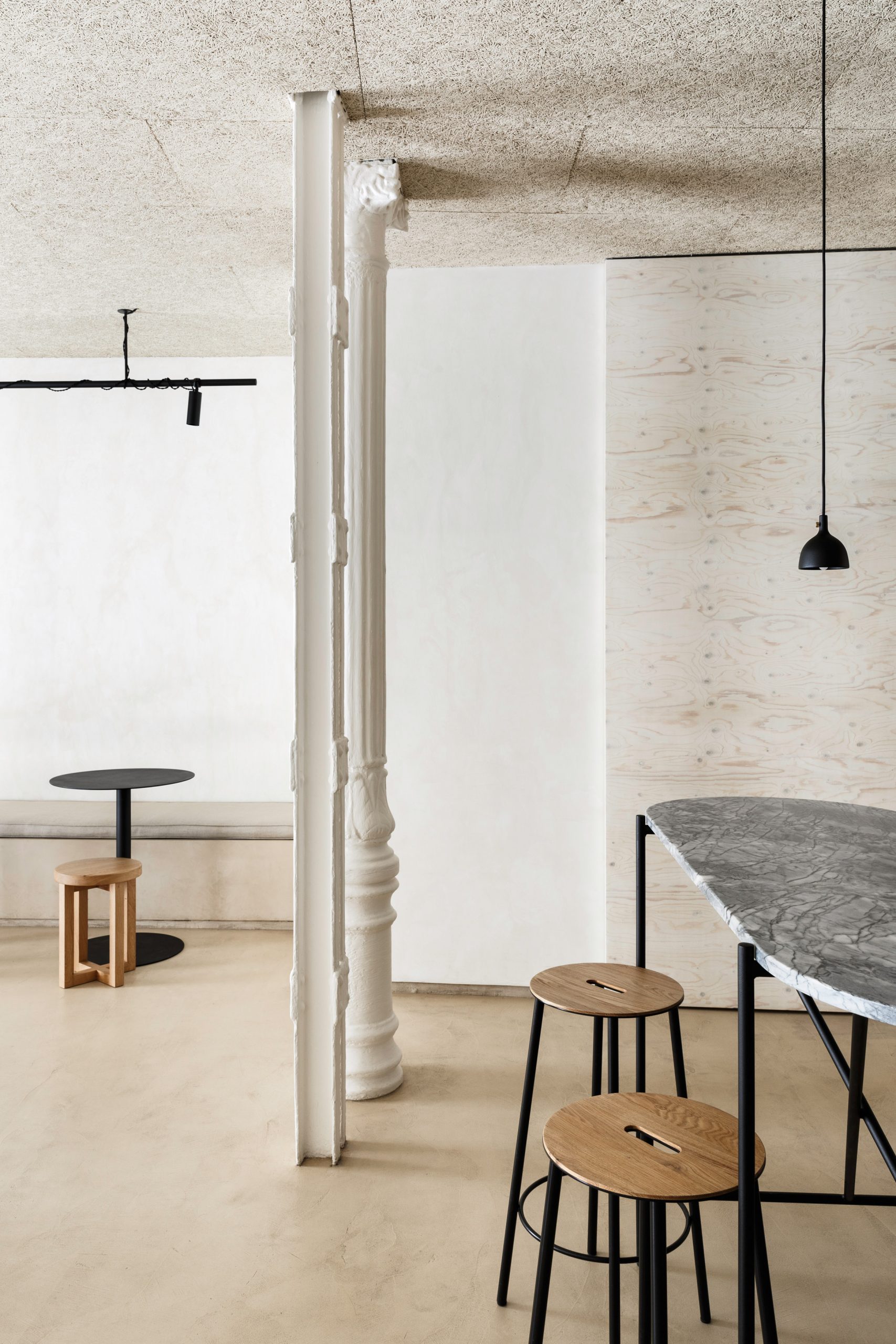
The 127-square-metre restaurant offers a menu of street food and homemade soups, which can be taken to go or eaten inside of a small, informal dining area.
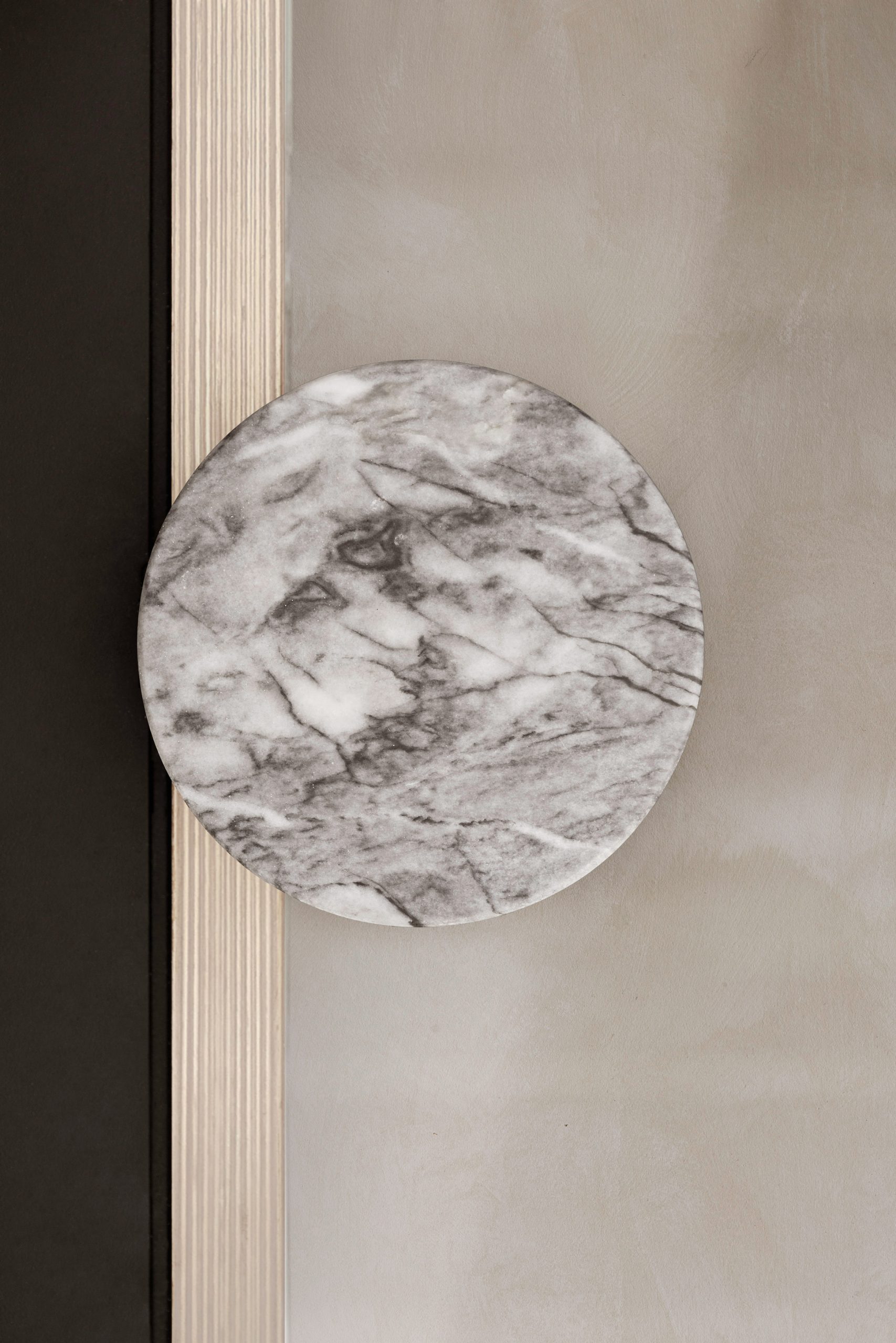
Plantea Estudio restored the original storefront, which had been altered by the previous owners, and installed bespoke pivoting doors with frames made of plywood and iron, and topped with marble handles.
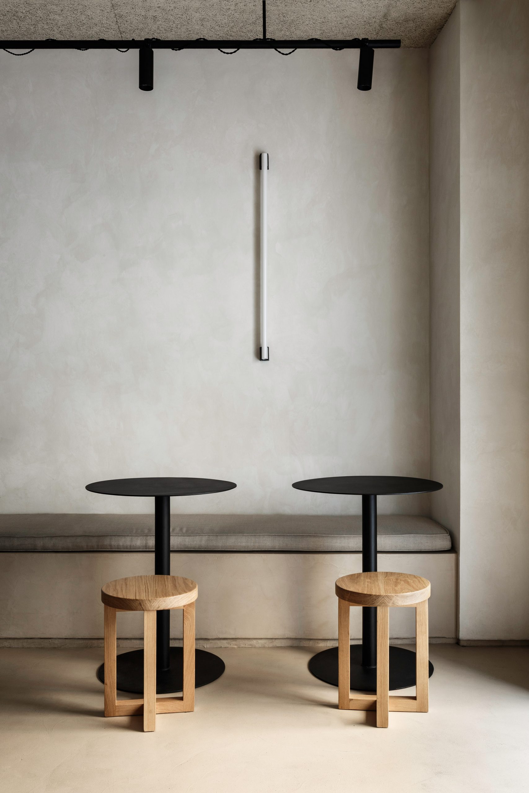
For the interior, the firm said it selected materials in “light and warm tones” to create a feeling of continuity and make the space appear larger.
Although similar in colouring, the materials were chosen for their different textural qualities, with micro-cement and plywood boards forming the walls and floors while chipboard was used to panel the ceiling.
“The light from the outside envelops them in such a way, that the limits between one and the other blur and the space is expanded to the maximum,” explained the architects.
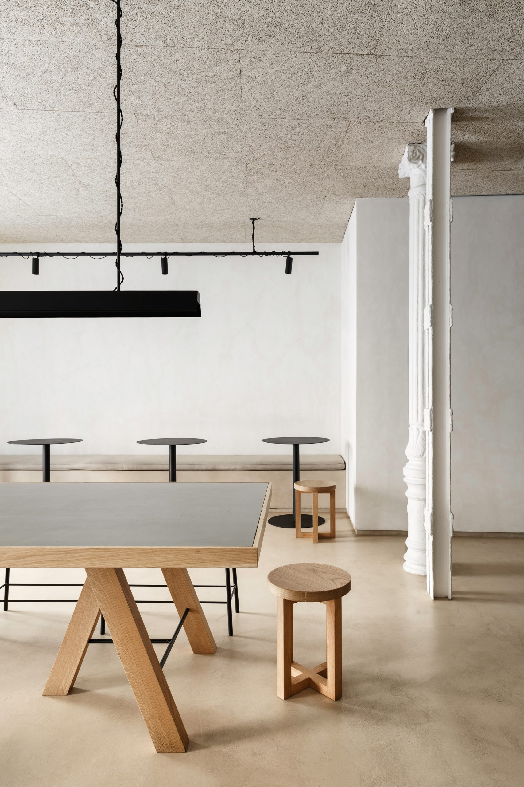
In contrast to the soft beige tones of the walls and floors, the studio installed furniture and fittings made from black lacquered steel with “geometric and precise” forms.
Much of this was designed specifically for the project, including a large communal table made from solid oak and finished with a sanded steel top.
Placed in the centre of the space, it helps to channel the flow of customers between the two entrance doors.
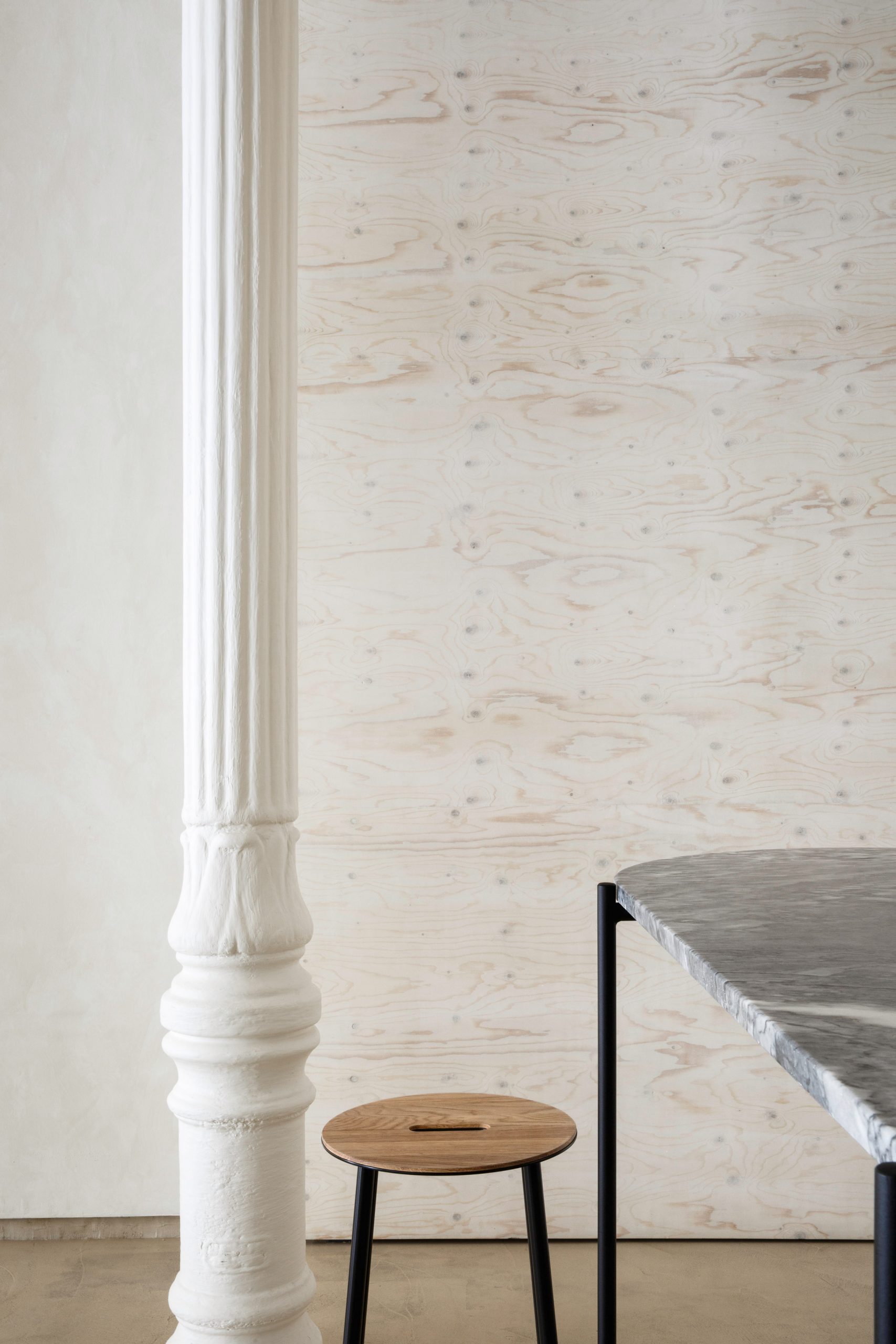
Two built-in, upholstered benches run along the walls on either side, paired with rows of lacquered steel tables and oak stools.
In the space beyond, two high tables with a steel base and grey Ruivina marble top sit in front of a serving counter made from these same materials and illuminated through integrated lighting.
Here, customers can eat their food either standing or seated on one of the bar stools with their oak veneer seats.
“All of these elements are introduced into a space where the floor and walls are finished in the same colour, so it looks like they are ‘floating’ in a warm atmosphere,” Plantea Estudio director Luis Gill told Dezeen.
“The materials that are touched by hand are kind and solid, always pleasant.”
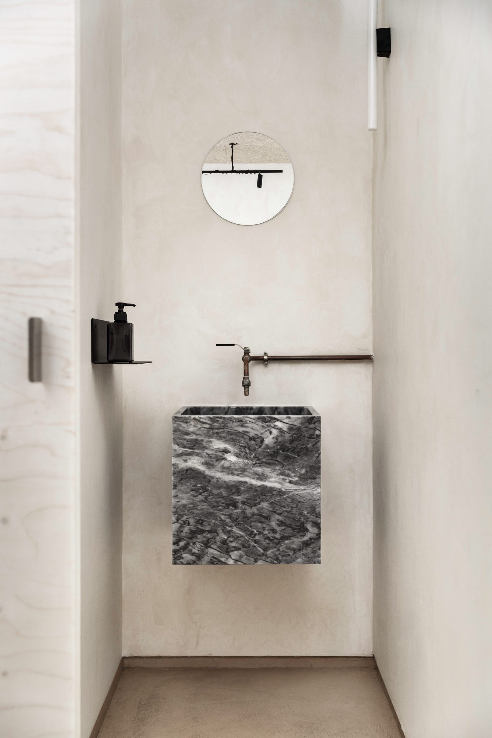
The illusion of objects levitating in space is carried through to the toilets, where a marble sink and soap dispenser are suspended from the walls.
The interior’s neutral colour scheme chimes with paint brand Dulux’s choice of colour of the year for 2021 – a “reassuring” earthy beige called Brave Gound.
Dulux argued that this “elemental” shade reflects “our growing desire to align more with the planet and looking towards the future”.
Plantea Estudio, which was shortlisted for emerging interior design practice of the year at the 2019 Dezeen Awards, has previously transformed a defunct erotic cinema into an art-nouveau theatre.
The post Plantea Estudio casts minimalist Madrid restaurant in shades of beige appeared first on Dezeen.