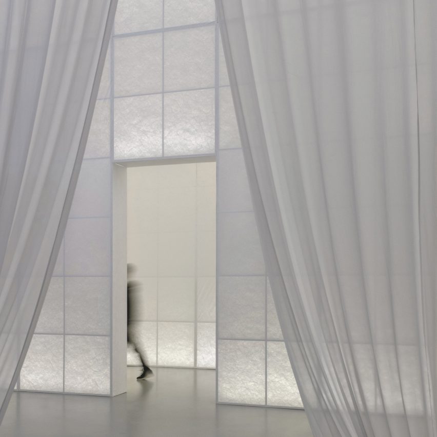
Chinese design firm Studio 10 has used translucent materials and winding ramps to create a series of abstract spaces to display artefacts at the Fashioned from Nature exhibition at the V&A‘s outpost in Shenzhen.
Studio 10 transformed the V&A museum’s gallery at the Fumihiko Maki-designed Sea World Culture and Arts Center in Shenzhen to host the exhibition on fashion and the natural world, which previously displayed in London.
The entirely new exhibition design divides the show into two sections.
The first section details the relationship between fashion and nature since the 16th century and has a design that references classical gardens.
Named Fashioned from Nature in China: Then and Now, the second part of the exhibition examines a similar theme but with a focus on China and takes a more contemporary design approach.
Studio 10 created a series of abstract spaces that guide visitors on a journey through the exhibition.
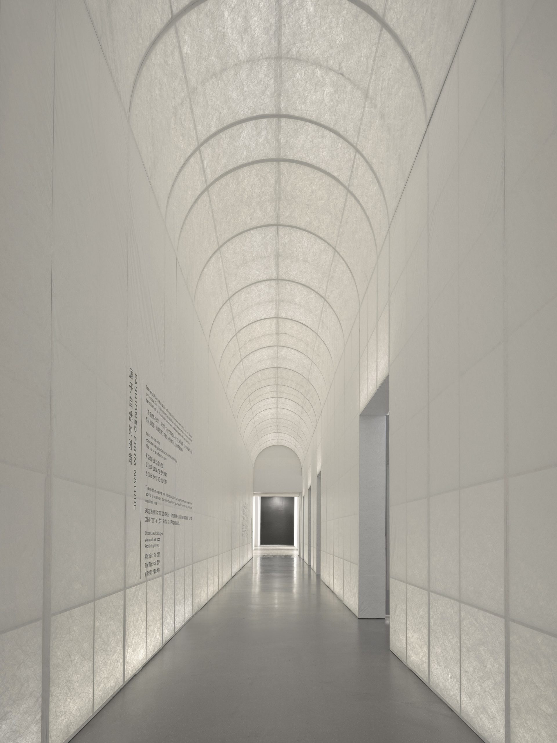
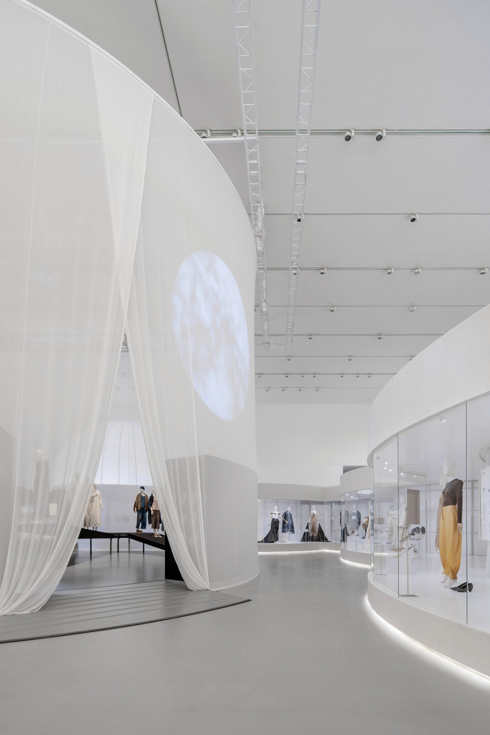
At the entrance, the studio used a steel structure wrapped in Tyvek – a translucent synthetic fabric – to create a long corridor that looks to reflect the uniformity and rigidness of classical gardens.
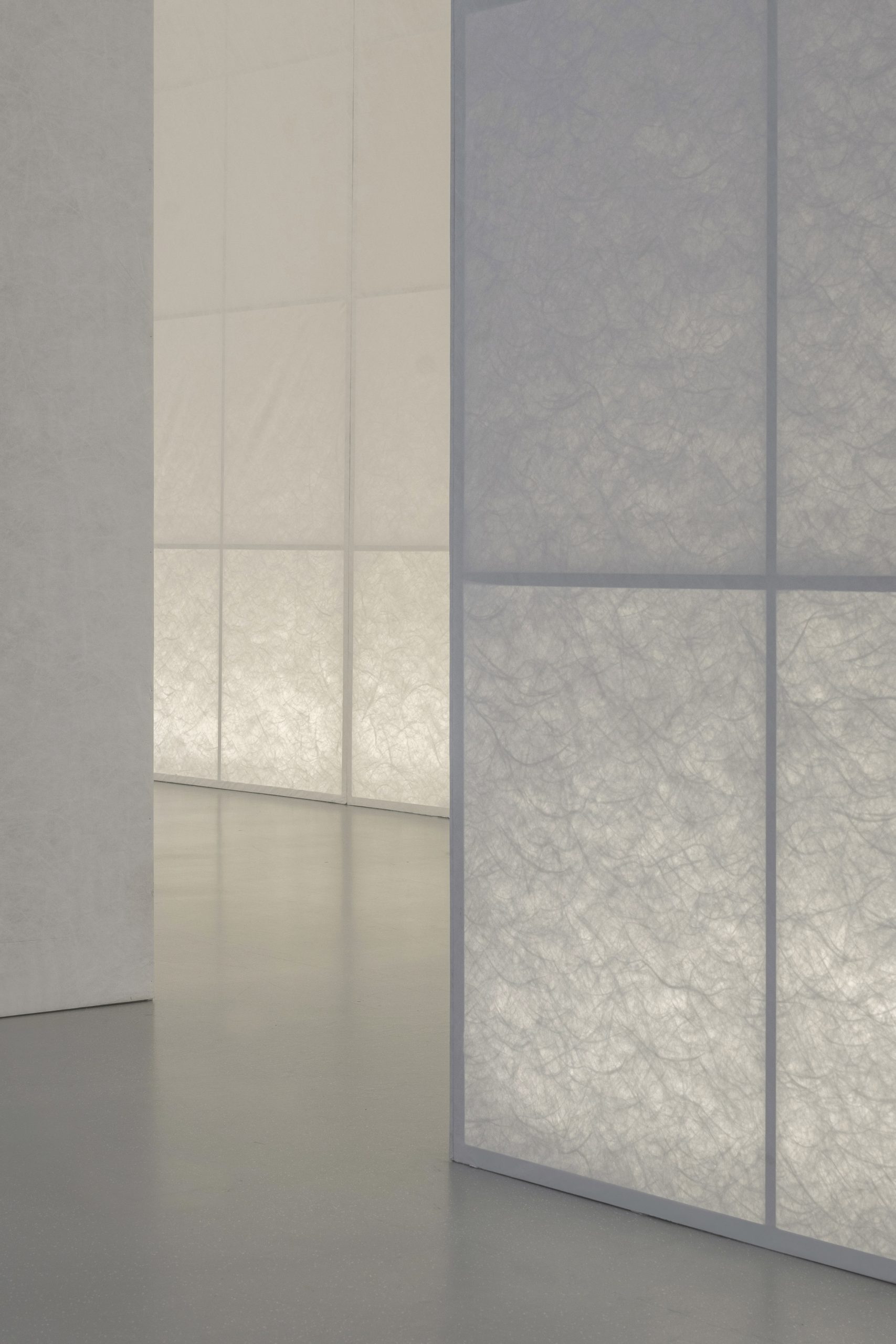
Translucent fabrics are backlit throughout the corridor to reveal “vine-like” fibres that mimic a tunnel of foliage.
“We debated using fabrics with prints of vegetation pattern for the entrance archway at the beginning,” said Studio 10 founder Shi Zhou.
“Eventually, we agreed that it should be the least literal to minimise distractions from the exhibits as well as to reinforce the ideas behind,” he told Dezeen.
“Therefore, we went with Tyvek, which faintly reveals the vine-like fibres, forming an abstract green corridor when backlit.”
The exhibition continues along the enclosed hallways and opens up to reveal multiple circular displays.
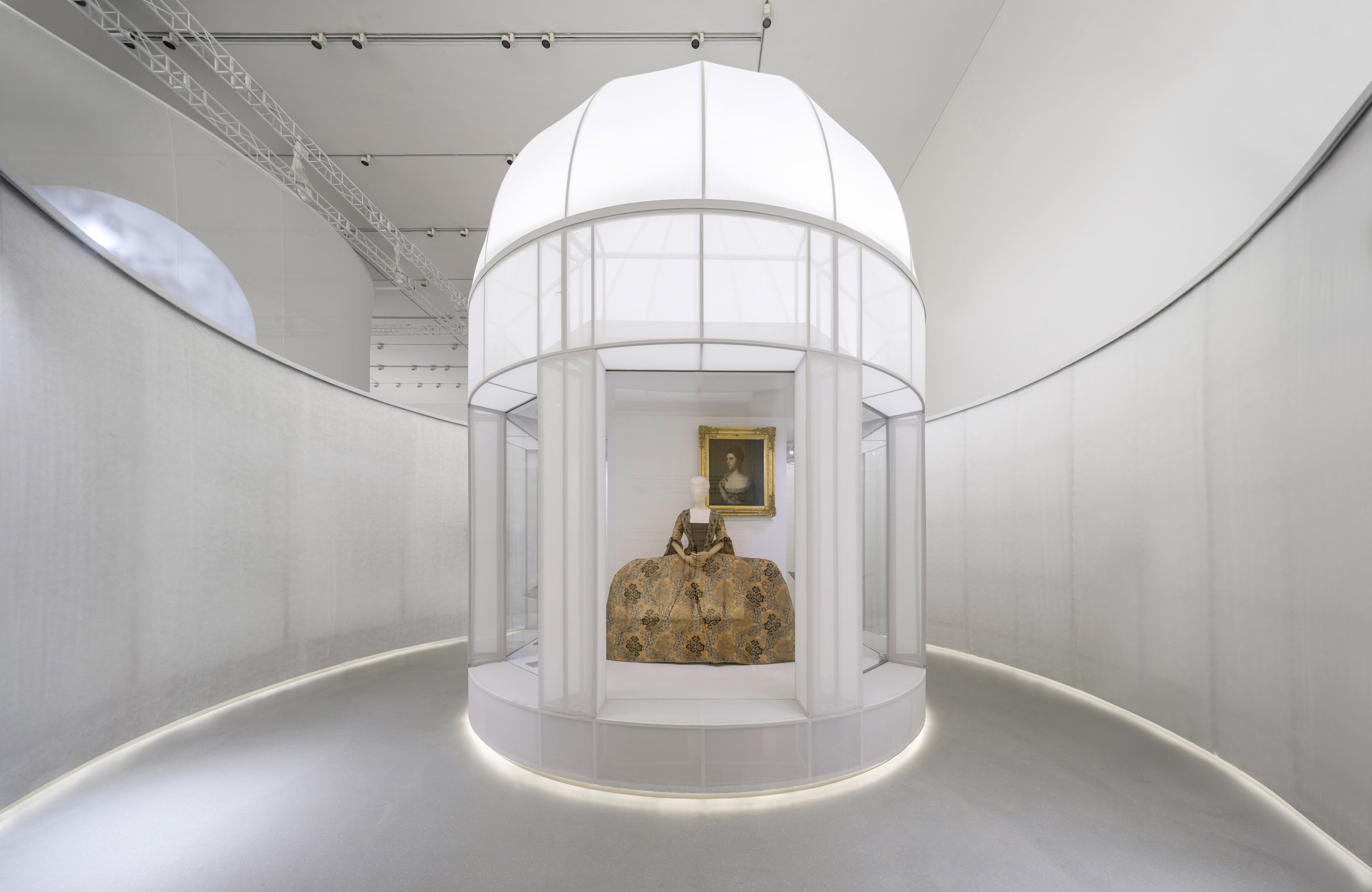
The first two spaces take form as fabric-wrapped domed structures that loosely resemble classical garden pavilions showcasing individual mannequins in 360-degree displays.
“Translucent fabrics are used to create an abstract ‘Western’ classical garden,” explained Zhou.
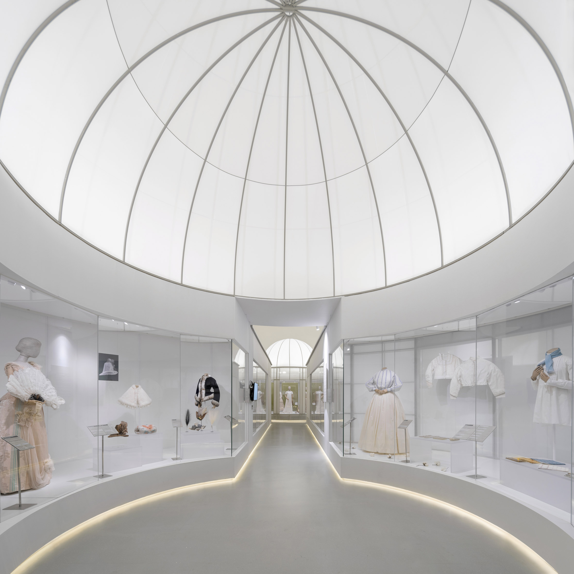
Visitors are guided along the hallway by strip lighting. In-between the domed structures, long corridors house a range of displays.
The central circular space forms a large back-lit dome that furthers the exhibition’s classical theme.
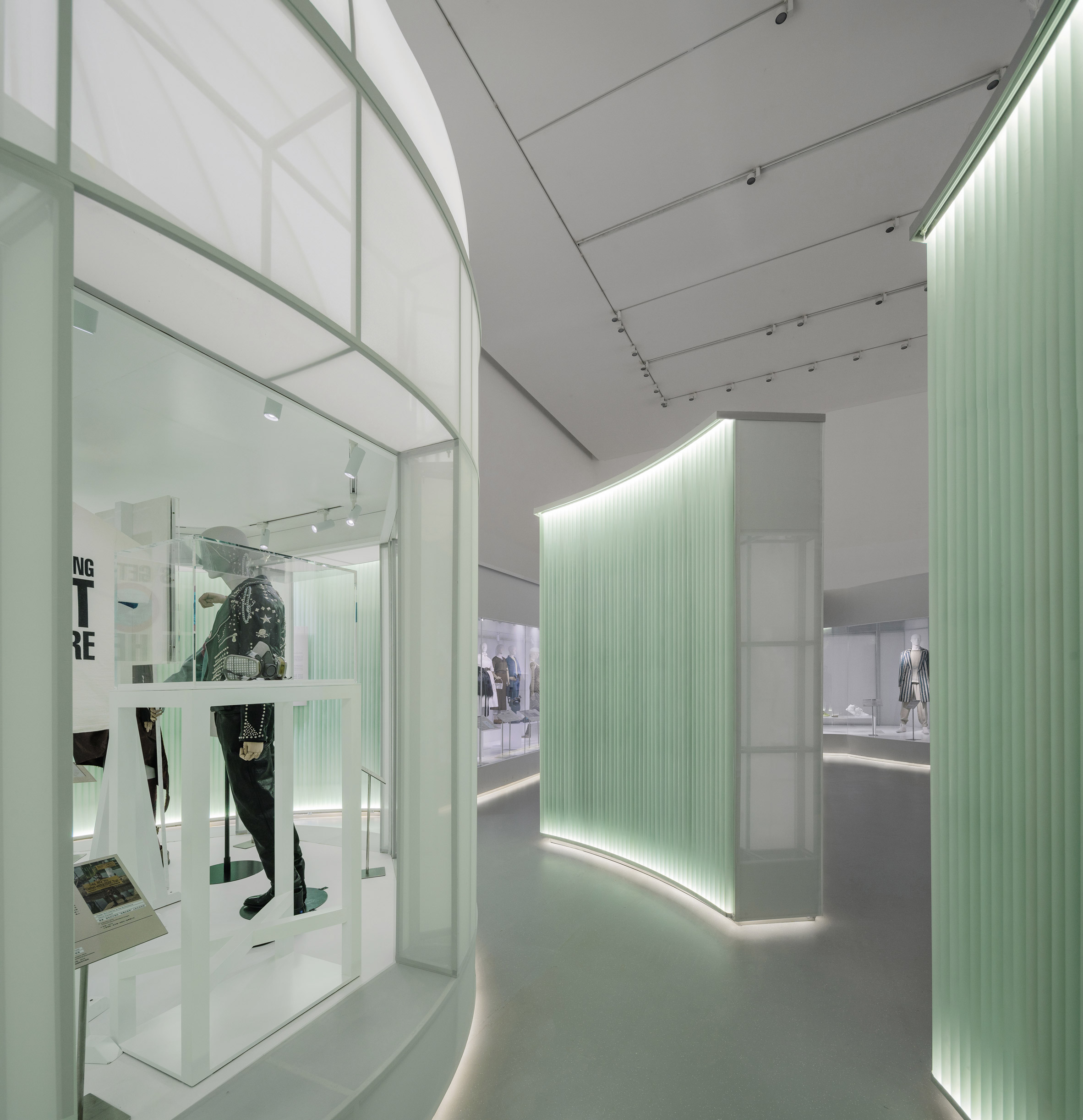
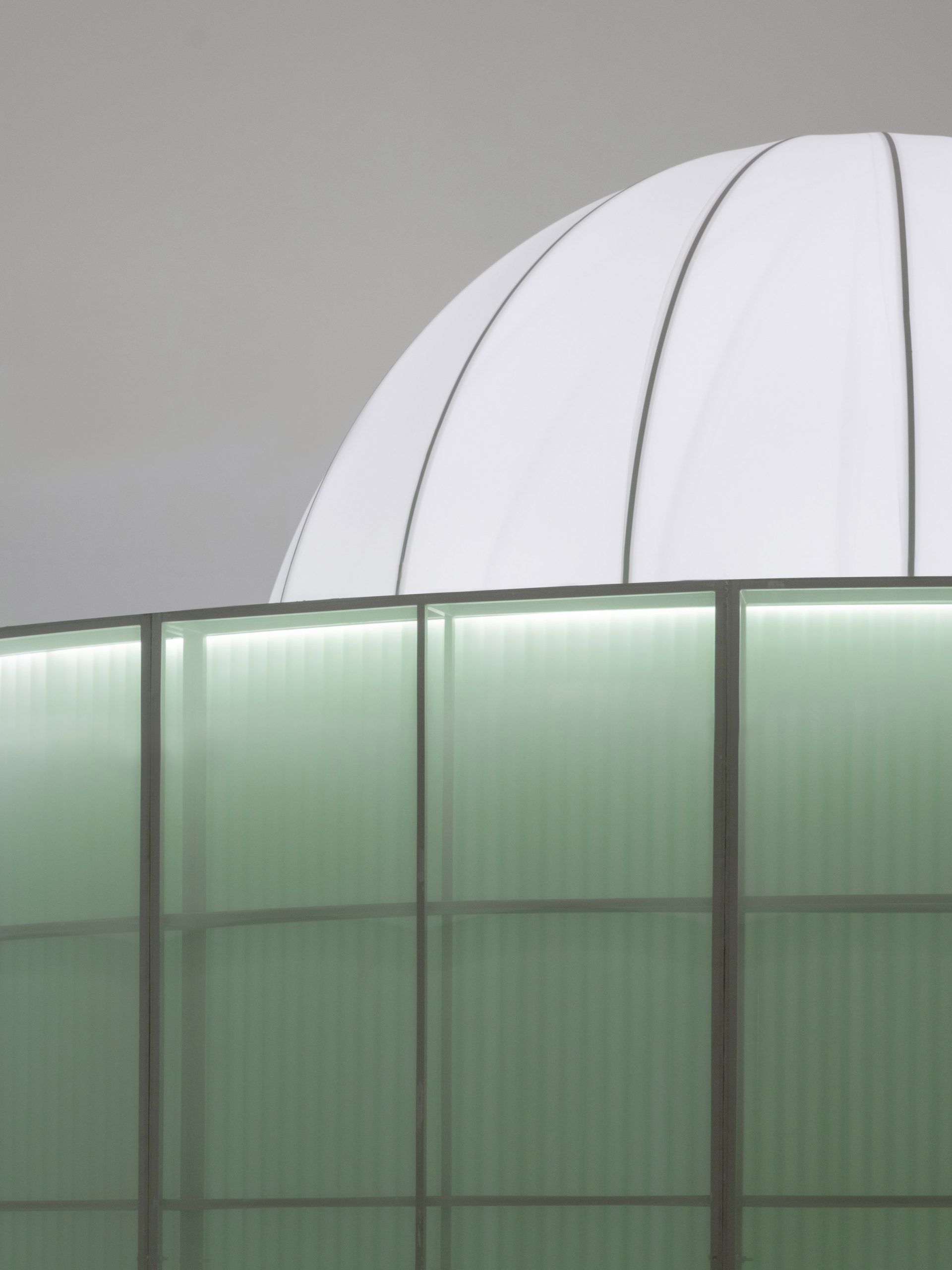
A collection of translucent acrylic pipes form a glowing wall at the end of the C-shaped hallway to create an unexpected contemporary contrast.
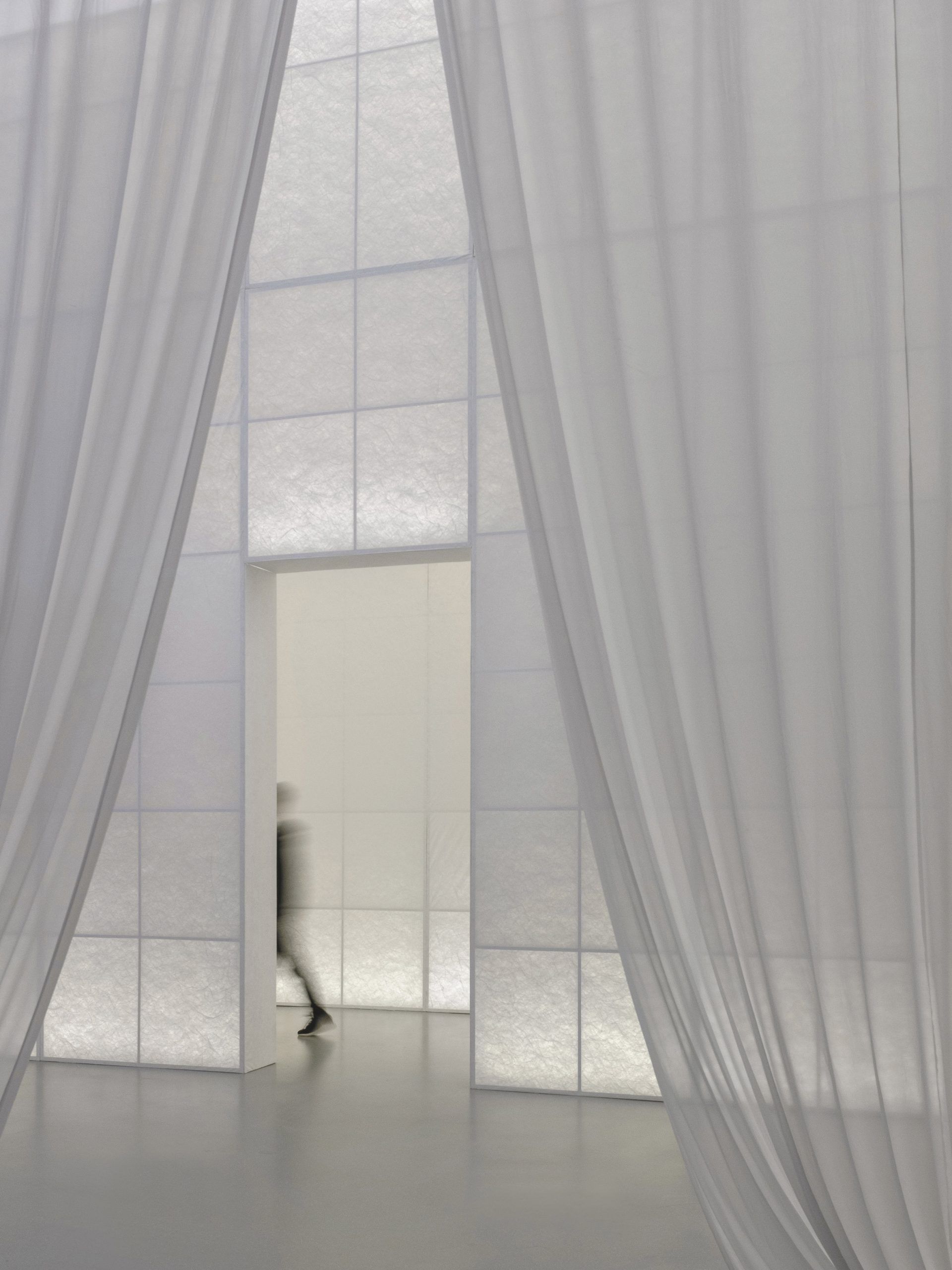
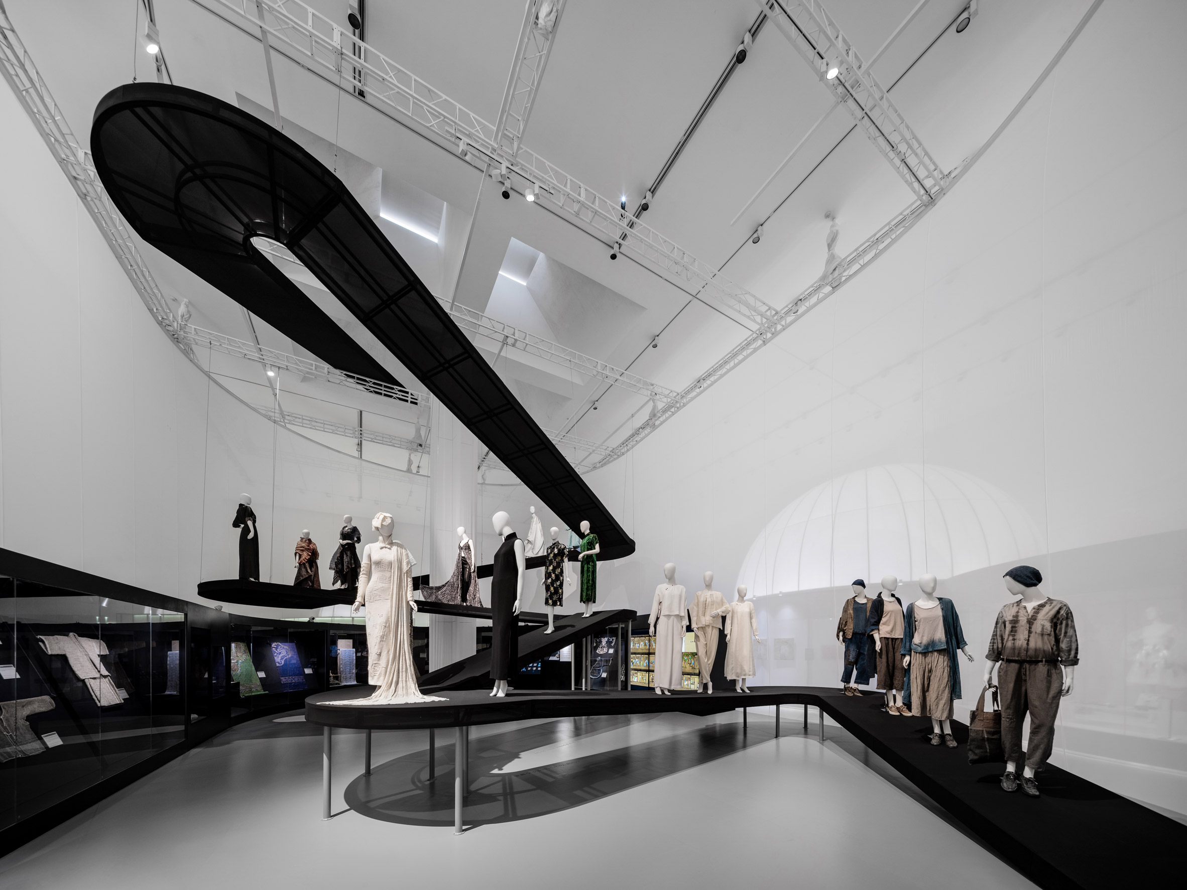
Beyond the glowing walls, the exhibition space opens up to reveal a vast semi-sheer curtain-enclosed gallery space incorporating a large black-winding ramp.
Mannequins showcasing various garments are placed along the ramp which forms a hill-like topography.
“A translucent ramp sits in the space, just like a mountain trail or stream meandering down from the sky, free and winding,” said Zhou.
“We would like the visitors to feel the natural views embodied in western and eastern gardens through the exhibition spatial experience, i.e. one being rational, symmetrical and perspective-driven,” Zhou continued.
“While the other being poetic, intuitive where visitors can roam around freely as if they are in a romantic and poetic nature setting.”
The studio looked to reflect the sustainable message of the exhibition by using materials that could be reused and recycled.
“The exhibition uses lightweight and translucent materials such as fabric, TPU and Tyvek to minimise its life-cycle carbon footprint, materials are specified to be locally accessible, recyclable and ecofriendly,” explained Zhou.
“There have been specific inquiries about the possibility to recycle and reuse the materials and disassembled parts after the exhibition in a new project.”
Other exhibitions designed by architecture and design studios include this travelling exhibition by MUT that includes five modular pavilions clad in scales made from leftover wood and this exhibition in Taiwan by B+P Architects that used swooping sheets of paper to frame the exhibit.
Photography is by Chao Zhang.
Project credits:
Design: Studio 10
Design Team: Cristina Moreno Cabello, An Huang, Jiaying Huang, Meishi Zhao, Xin Zheng, Jiaxiao Bao, Feifei Chen.
Graphic Design Consultant: SANYI_Lab
Construction Drawings Consultant: SHENNAN Design
Lighting Consultant: JOJO Lighting
Contractor: Shenzhen Pico Plus Services Company Limited
The post Studio 10 divides up Fashioned from Nature exhibition with translucent corridors appeared first on Dezeen.