The Final Entry Deadline for the 9th Annual A+Awards is fast approaching. Remember to submit your projects before April 23rd to be in the running.
It is easy to overlook the outsized role that transport interiors have in our daily lives. More than infrastructures that facilitate movement between various places, bus and train stations, ferry terminals and airport concourses all serve as nodal points in the complex webs of connection that entangle us as 21st-century humans. Therefore, the designs of these dynamic indoor spaces play a double role in guiding a multitude of diverse and intersecting passenger journeys while also serving as gateways to cities and towns that they are located in.
While airports may be the modern-day gates to many cities, more quotidian typologies like subway pavilions or bus terminals can play a powerful role in place-making and represent an essential part of urbanites’ day-to-day. How can architects strike a balance between the logistical need to guide travelers to the next stop on their journey while also creating a meaningful and memorable experience?
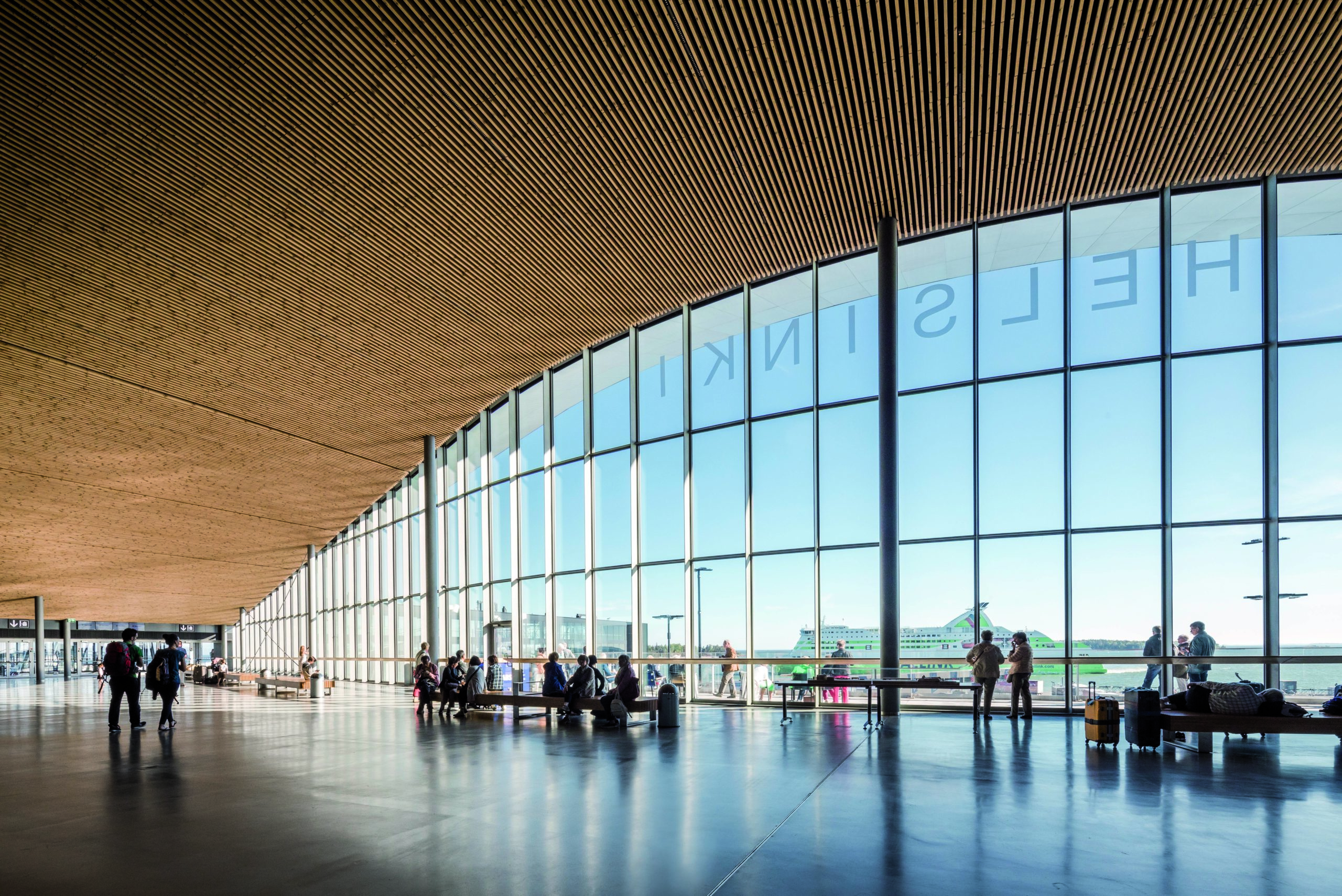
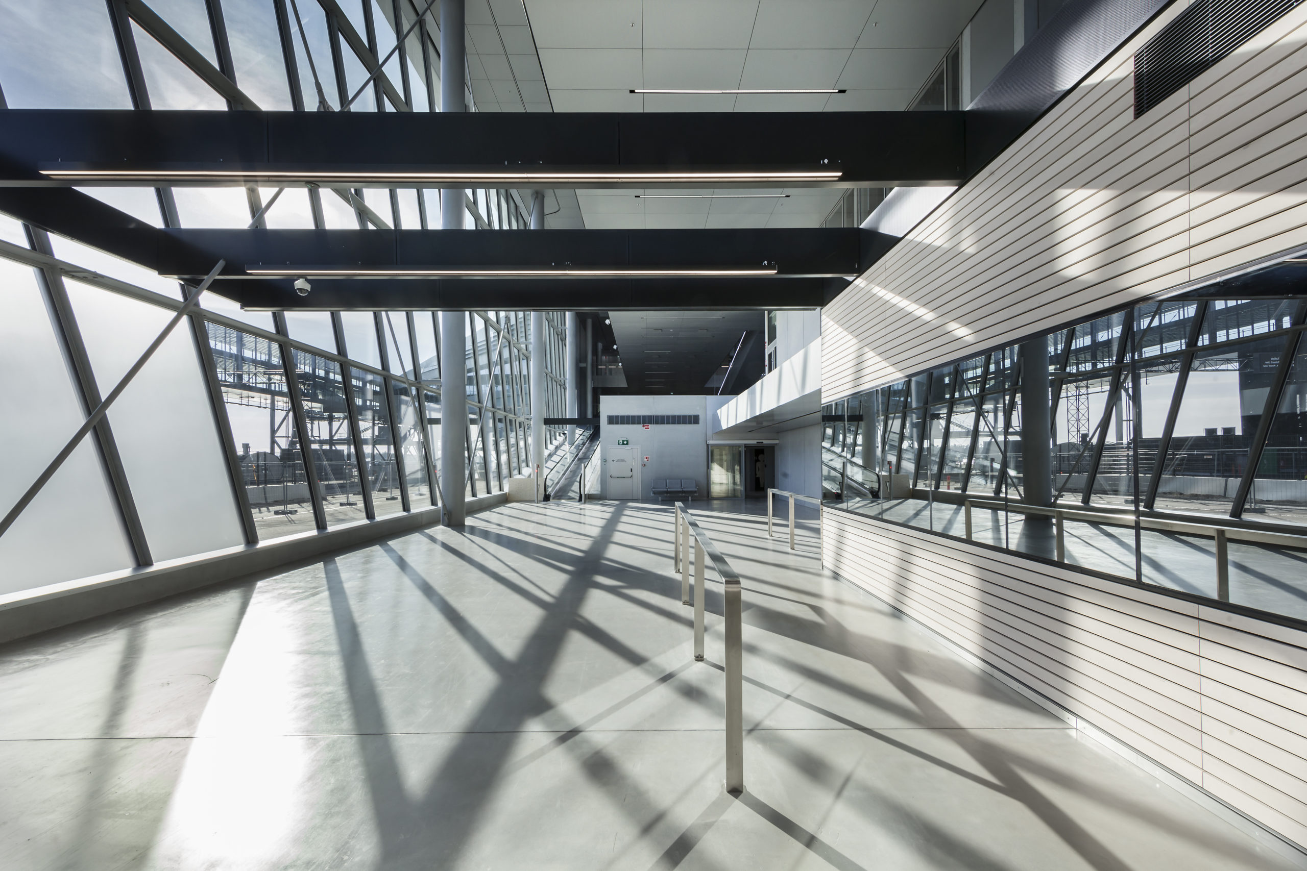

West Terminal 2 by PES-Architects, Helsinki, Finland. Jury Winner, 2020 A+Awards, Transport Interiors
While city gates of the ancient past and even 19th-century railway stations relied on their facades’ representative power to communicate their importance to visitors and locals alike, these days, the interior of transportation buildings holds a more prominent place in travelers’ minds. From daily commutes to cross-time zone journeys, at the best of times, the physical act of travel can be exhausting, stressful or overwhelming. These feelings may be exacerbated if the experience is one of disorientation.
Successful transport interiors should intuitively direct passengers to help make their journeys more smooth. With large flows of individuals, each with a distinct itinerary, this is no easy task. To make the experience more pleasurable, designers must orchestrate the dynamic dance of crisscrossing passengers rather than simply funneling the masses from one area to the next. Take, for example, the West Terminal 2 in Finland, which was built to accommodate growing ferry traffic on the Helsinki-Tallinn route. Sited in a former freight port area, the new terminal aims to reduce the turnaround times of ferries, largely by speeding up the boarding process.
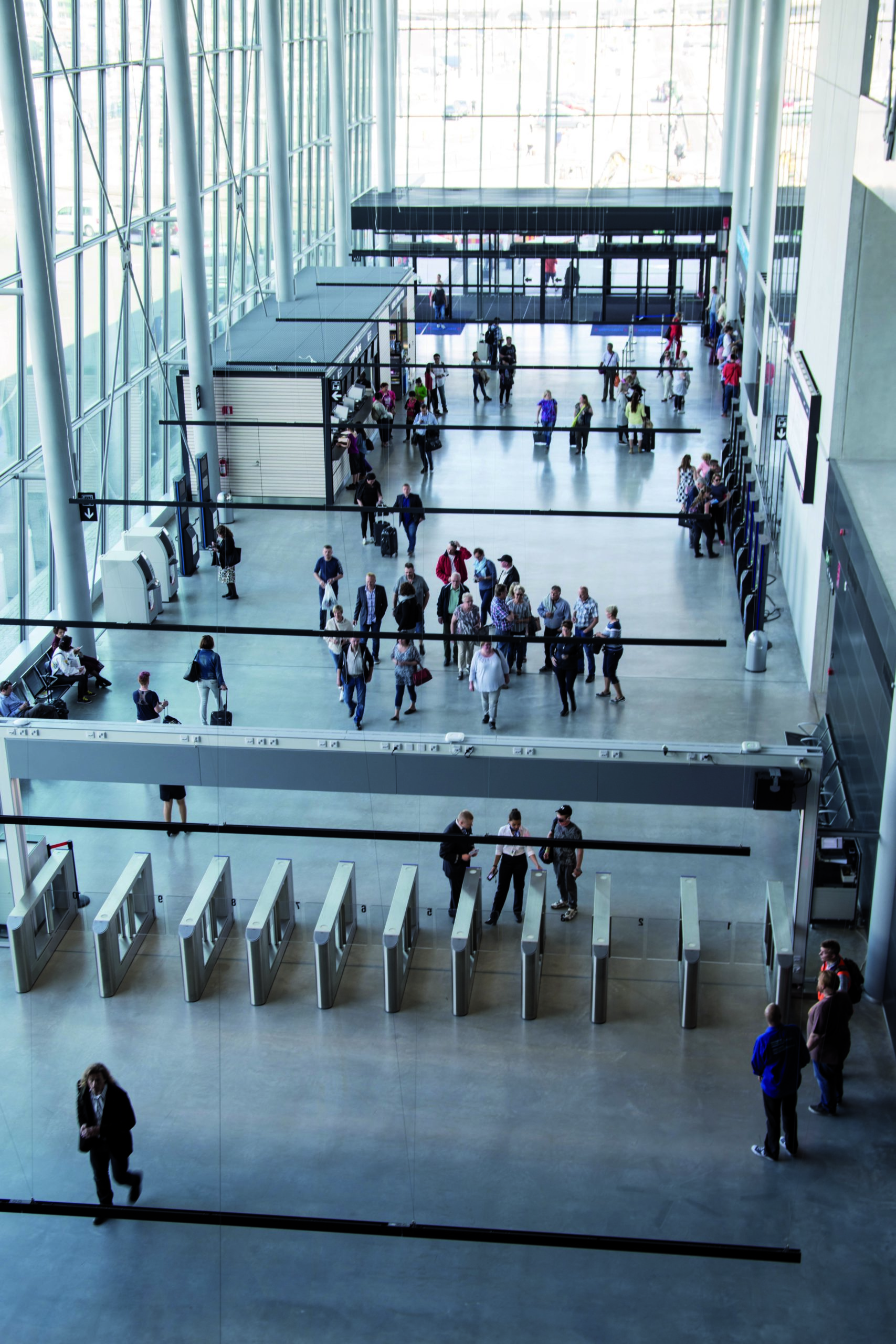
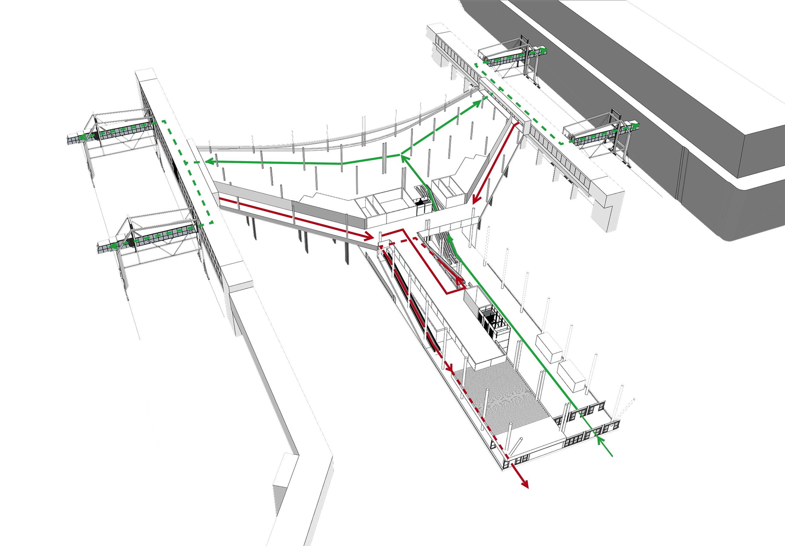

West Terminal 2 by PES-Architects, Helsinki, Finland. Jury Winner, 2020 A+Awards, Transport Interiors
Located between two quays, the terminal maximizes the small plot size—the majority of the dock is reserved for the vehicles queuing to board the ferries. The departure lounge is raised above the ground, allowing traffic to flow smoothly beneath; this provision aims to minimize passengers’ walking distances along the corridors and bridges to the ships. Meanwhile, the compact ground level is a transitory space with soaring glass walls, where arriving passengers quickly check-in before taking escalators and lifts to the upper level. Arriving passengers flow through a separate area on the same level, avoiding confusion.
The use of high glass walls offers all straphangers sweeping vistas of the sea and ships. In summer, a seaside terrace provides those waiting with a pre-departure breath of salty air. The soaring curves of the wooden ceiling are both visually arresting and a practical provision; their downward slopes are intended to help direct passengers by allowing them to the location of the boarding bridges. More than efficient, the space is elegant.
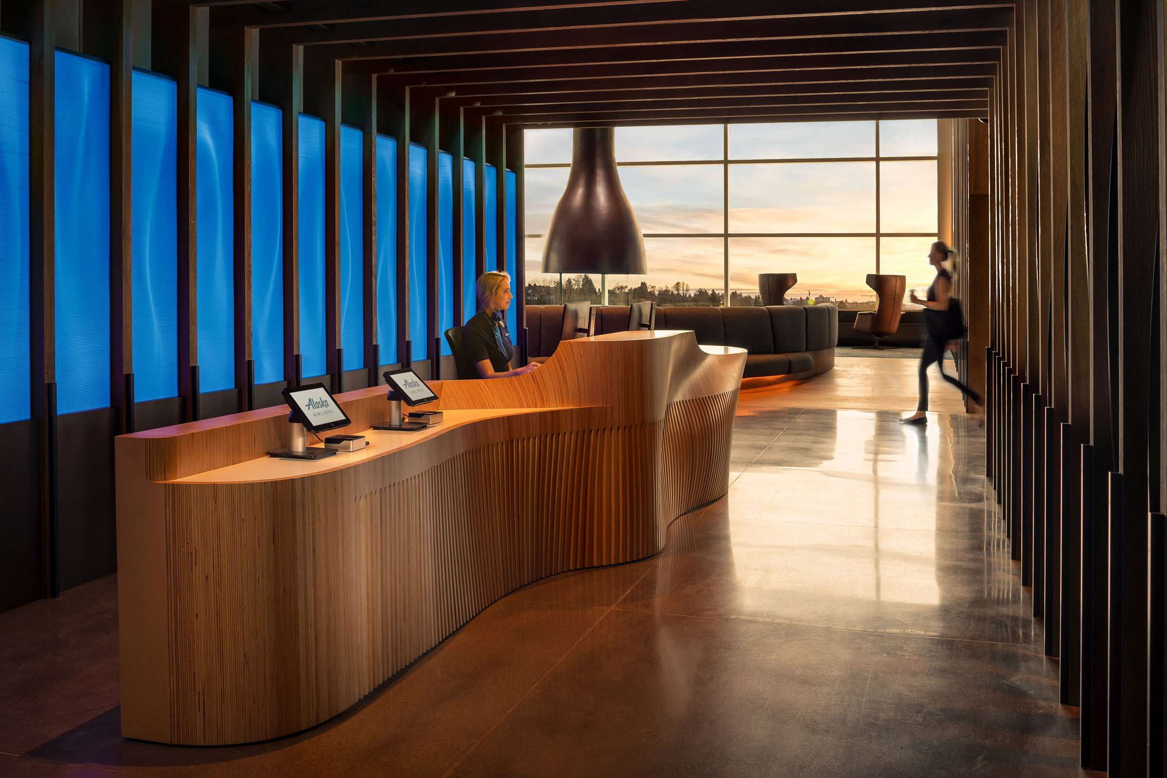
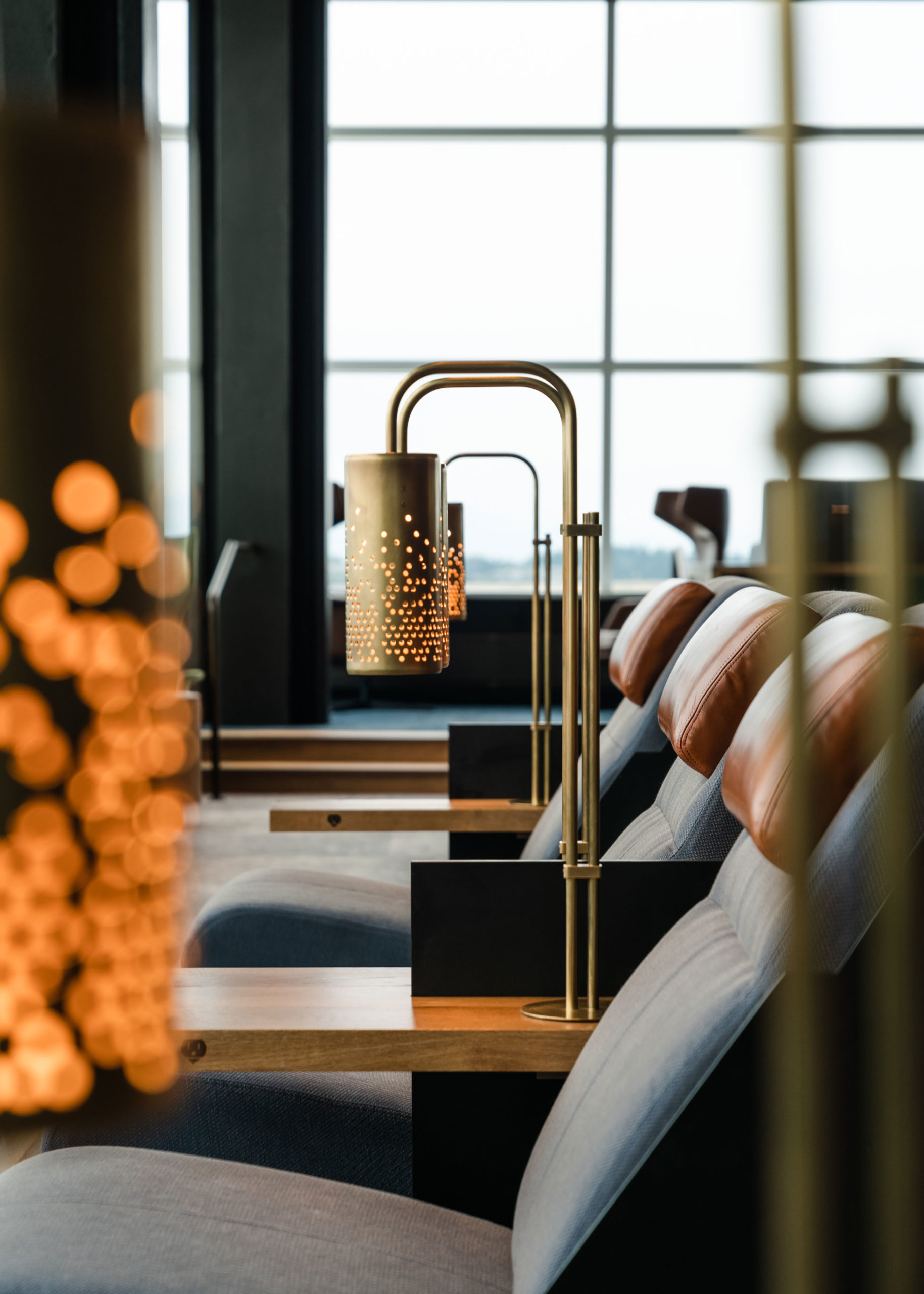
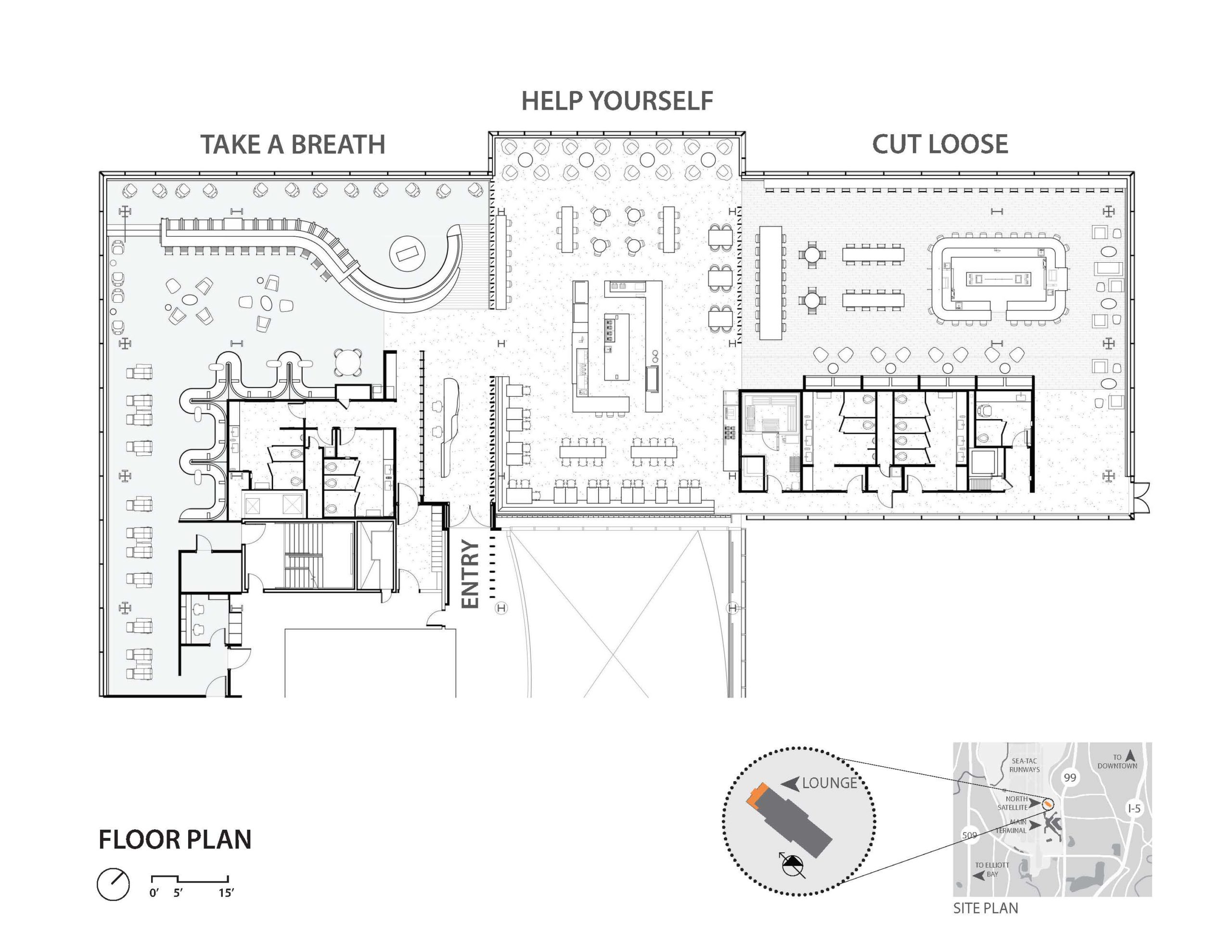
Alaska Airlines Flagship Lounge by GRAHAM BABA ARCHITECTS, Seattle, WA. Popular Winner, 2020 A+Awards, Transportation – Transport Interiors
Even if the airport or station is designed for intuitive navigation, there are many other factors in a journey that can make travel stressful, from cancellations and delays to the nerves that come with leaving home or simply juggling logistics. Transport interiors should be designed to help calm and soothe travelers. While this aim should be extended to concourses, gates and terminal, airport lounges, such as the Alaska Airlines Flagship Lounge in Seattle, serve as an example par excellence of how designers can create transitory spaces repose from the anxieties related to transit journeys.
While lounge typologies are widely assumed to be exclusive havens for business travelers, GRAHAM BABA ARCHITECTS sought to offer a warm and welcoming space for guests to refuel and connect. At the heart of their concept was the desire to create a seamless range of experiences so that travelers could find their own sense of homey comfort.
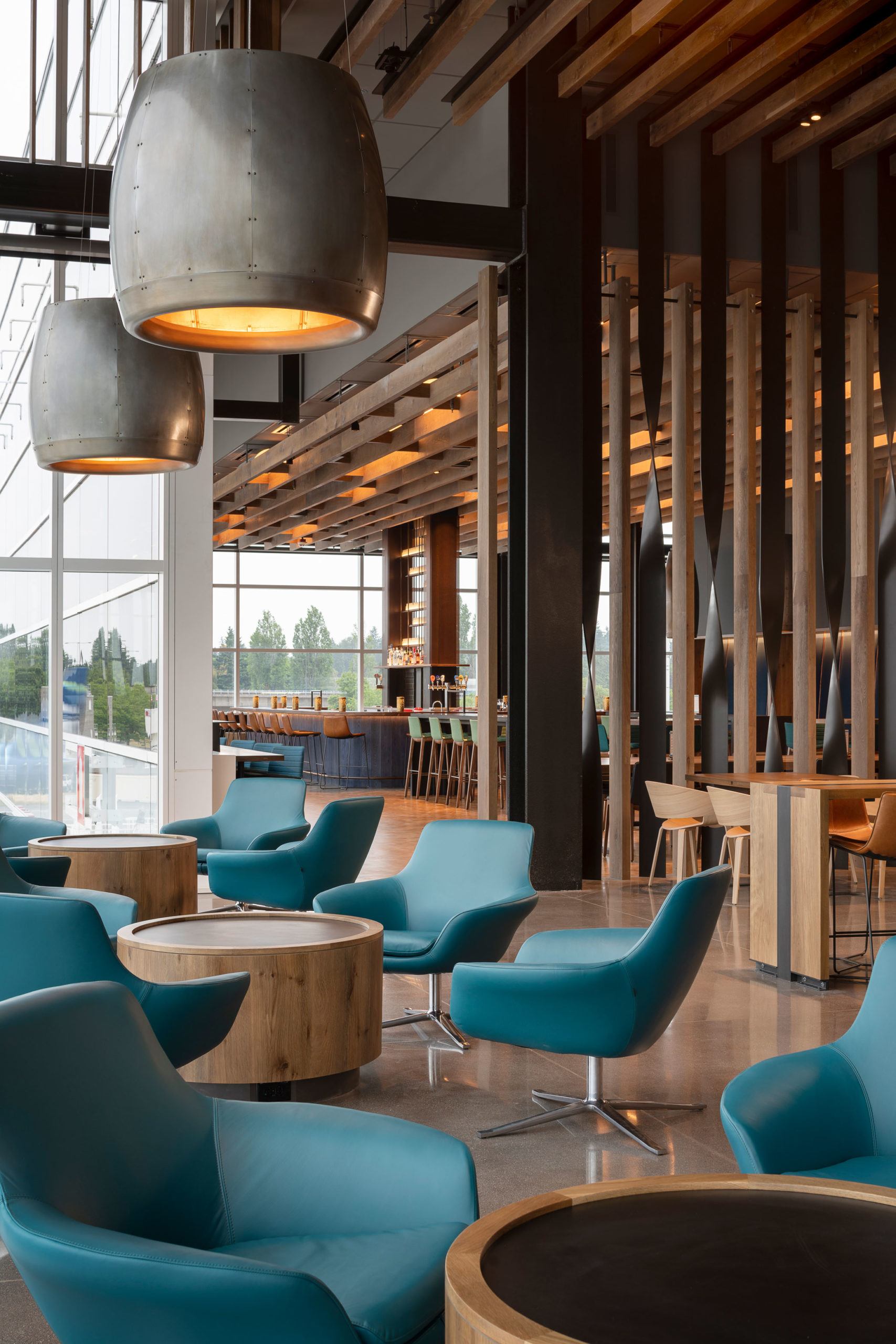
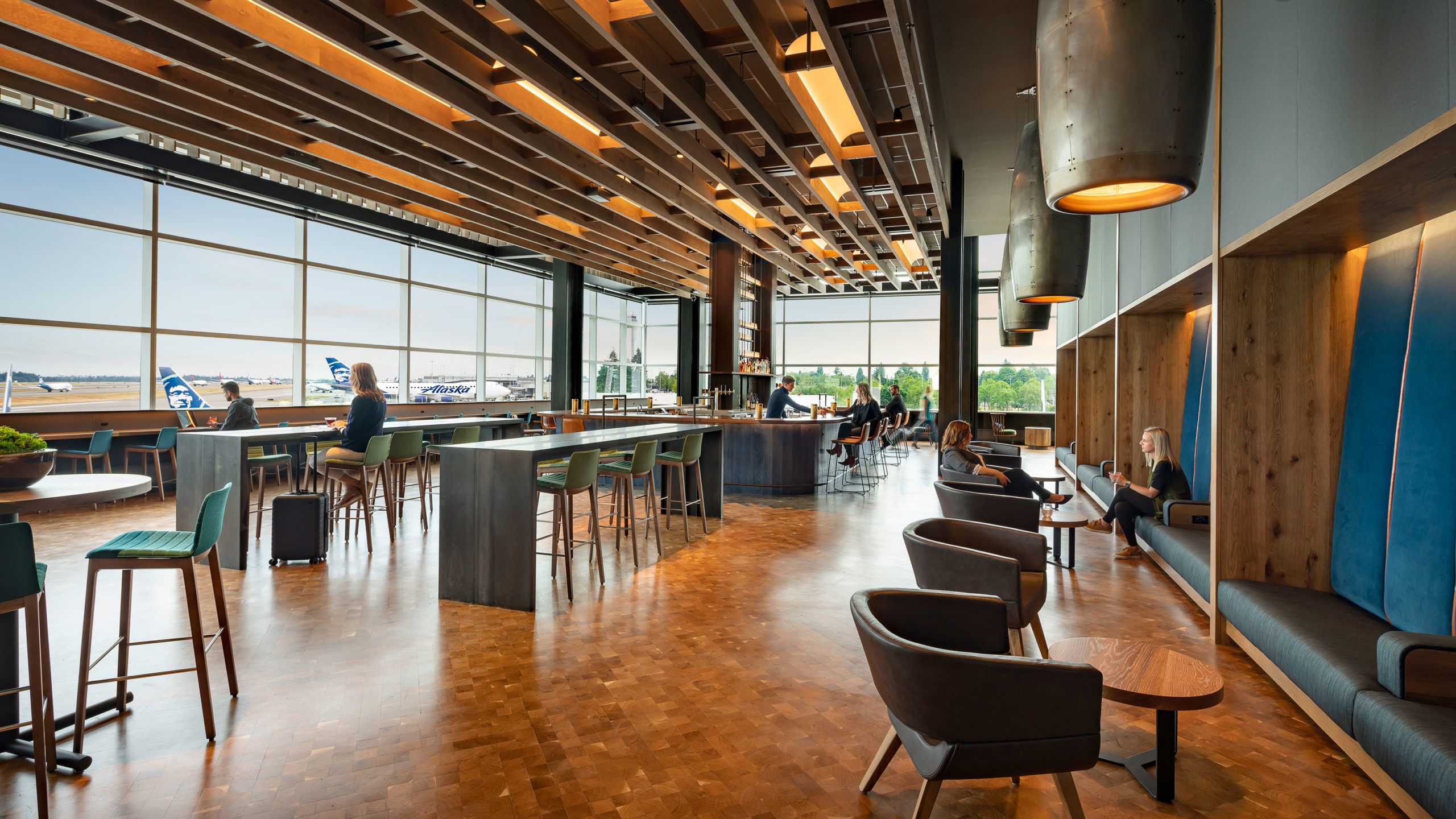
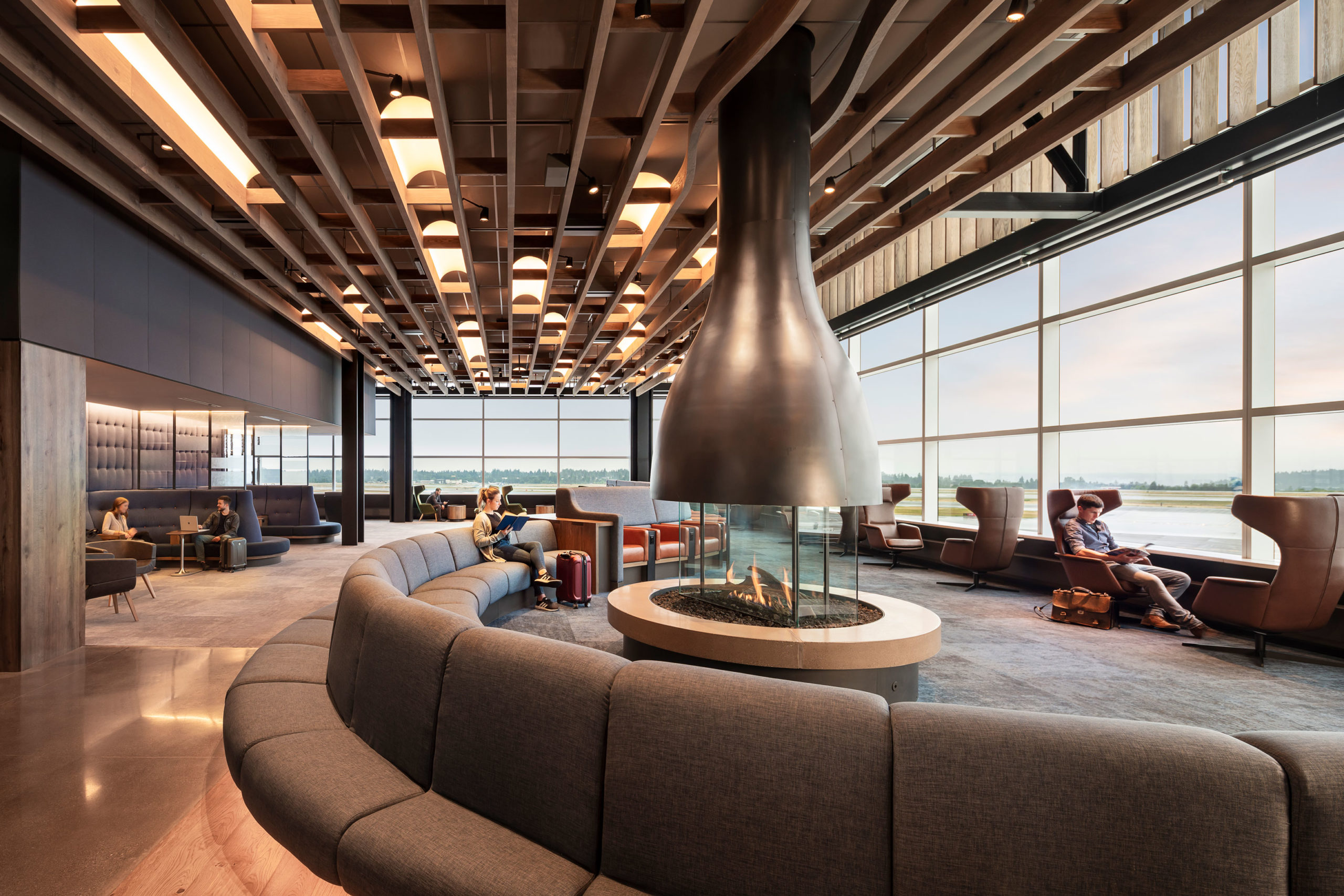
Alaska Airlines Flagship Lounge by GRAHAM BABA ARCHITECTS, Seattle, WA. Popular Winner, 2020 A+Awards, Transportation – Transport Interiors
From the distinctive light fixtures that recall jet engines to the recycled cardboard screens that announce the entryway, Alaska Airlines celebrate local artisans and artists. On the one hand, the move is a symbolic statement of the airline’s West Coast heritage. At the same time, the high quality and distinctive nature of the space is attributable to this meaningful, material connection with the Seattle region. Far from being a transitory space—even if guests may spend just a few hours there, the lounge is intended to be a home-away-from-home whose strong sense of place is strongly bound to the Pacific Northwest.
Whether catering to local or international visitors, the most successful transit designs deftly account for the complex and intertwining journeys they host while also providing their unique and memorable experience. Moving beyond the accommodation of high traffic flows means accounting for the physical, infrastructural logistics of spatial organization in tandem with the well-being of the multitude of individuals regularly passing through. Not all transit centers can provide their passengers with custom, artisanal lighting and furniture. Still, they can leverage quality detailing and spatial poetics to help elevate journeys from being necessary steps to reach a destination to enjoyable—and maybe even memorable—experiences in their own right.
The Final Entry Deadline for the 9th Annual A+Awards is fast approaching. Our Transportation typology category celebrates excellence in transit on all scales—from bus & train stations to marinas & ports, parking structures to international airports. Remember to submit your projects before April 23rd to be in the running.
The post Transport Interiors: How Architects Can Make the Journey Part Of the Destination appeared first on Journal.